
2026 Topps (above and below)
BY MARK A. LARSON
Editor & Publisher
March is a month of anticipation.
Spring is in sight. The baseball season is fast approaching. And in older times, Topps’ new baseball cards were about to be released.
Although issued earlier now, Topps’ annual, main set — also known as its flagship set — was eagerly anticipated by collectors as the second half of March arrived. Seeing boxes of brand new packs on store shelves was nothing short of thrilling. The anticipation turned into excitement when opening those first packs and viewing the fresh card design for the first time.
Many collectors these days may not give a hoot about the design of the cards in Topps’ flagship set. But being somewhat of a traditionalist, I still do. Before the hobby boom of the 1980s, collectors often discussed at length the pros and cons of each year’s card design. Remember, back then Topps was the only major company producing baseball cards (and usually only one large set per year).
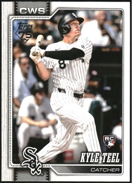
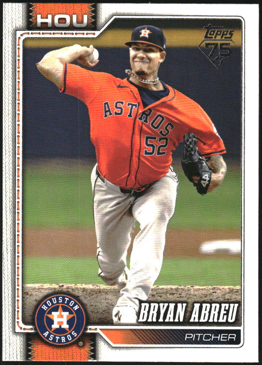
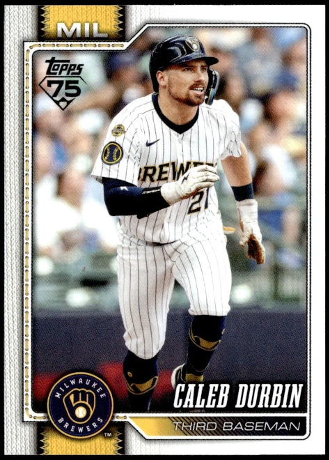
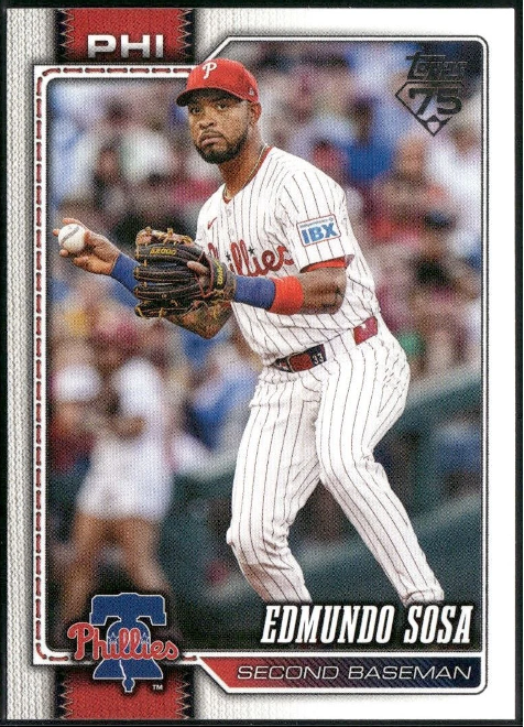
2026 Topps
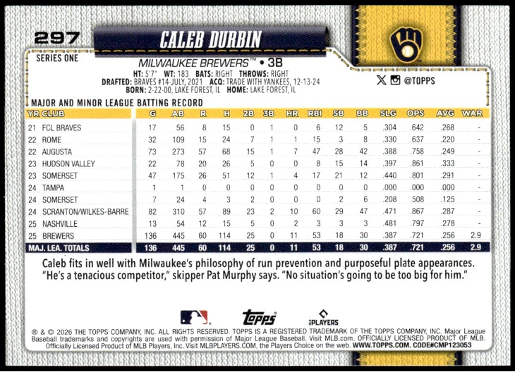
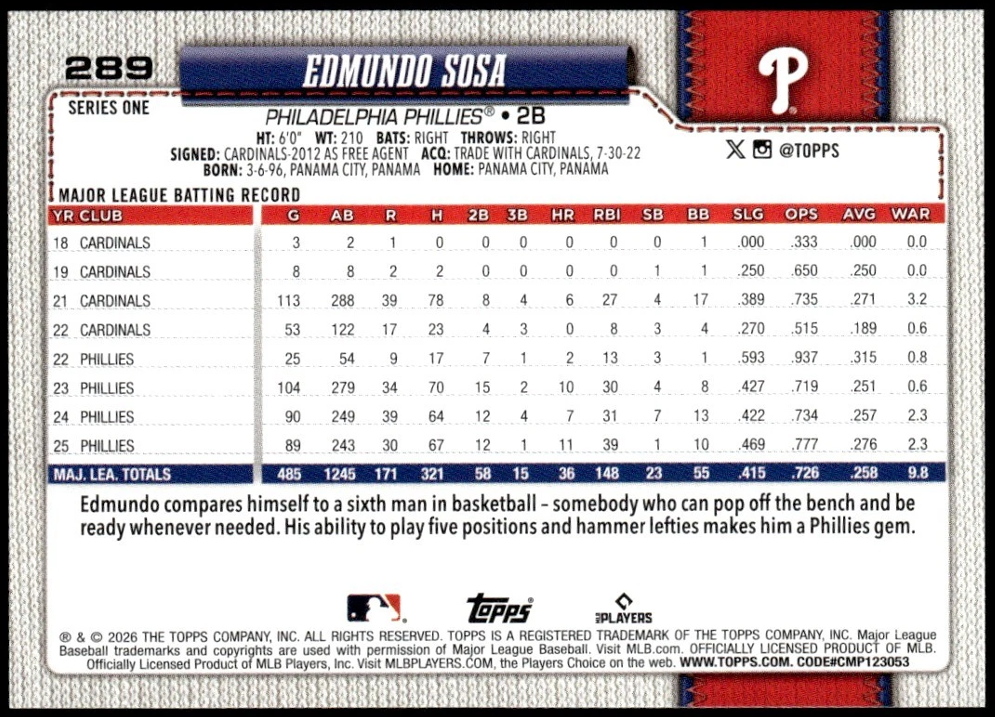
The 2026 Topps flagship set is its 75th and the milestone is noted on card fronts. This year’s design is sharp. The left side features what appears to be a color-coded ribbon depicting an abbreviation of each team’s location at the top. The bottom of the ribbon features a team logo. The left side of the card border utilizes a gray fabric-like design and then fades to white on the right side. Card fronts are clean, crisp and easy to read. Backs continue with the ribbon design … which adds some flair and spruces it up a bit. As usual, the fun-to-read stats are shown.
Over the past four years, the card designs on Topps’ main sets have improved a bit. There seems to be a little more creativity in blending the traditional elements we’ve come to expect from Topps. For several years, geometric designs prevailed. Prior to that, colored borders. Both were OK, but not too exciting. Plus, overall photography is a little better now.
Here’s a brief recap of Topps’ other three sets issued over the past four years – starting with 2025 and going backwards:
2025 Topps
……………………………………………………….
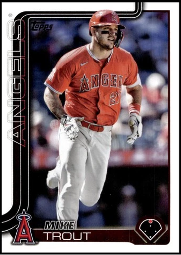
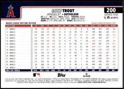
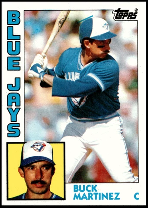
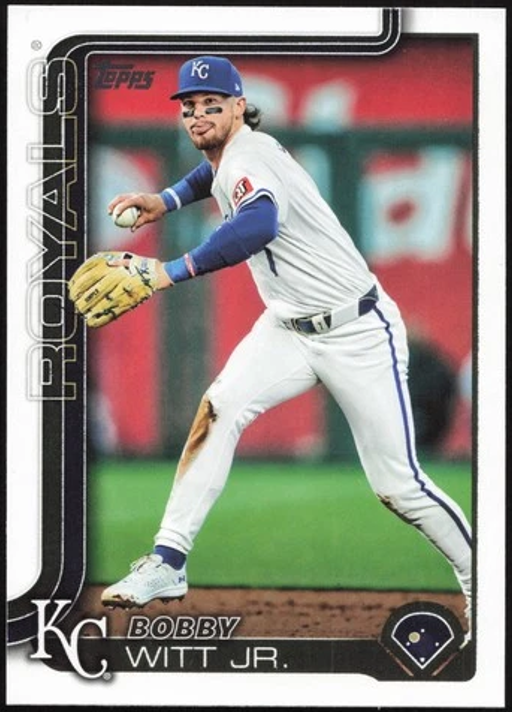
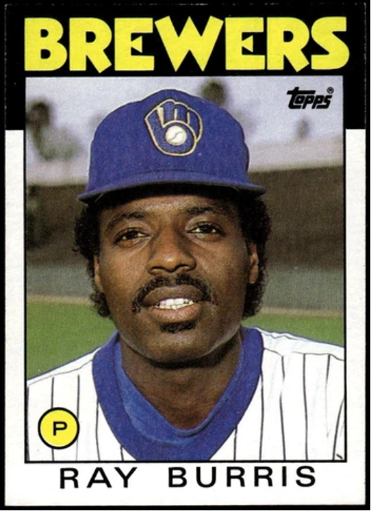
Last year’s design was nice and included one innovation. On the lower right-hand corner of card fronts was a small layout of a baseball diamond, including bases. The position of the player depicted on the card was shown with a dot on the field. On Mike Trout’s card (above), a red dot is in center field. The idea is great, but it probably should have been a little larger. In addition, the team name on the left side is a bit hard to read. Over the years, Topps’ designs did not include a team down the left side very often … most notably in 1984 (below). Nothing too special about the card backs in 2025. Of the four set designs discussed in this article, this is probably my least favorite – but still good.
2024 Topps
……………………………………………………….
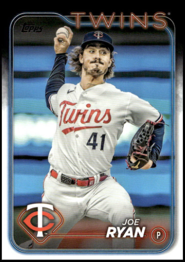
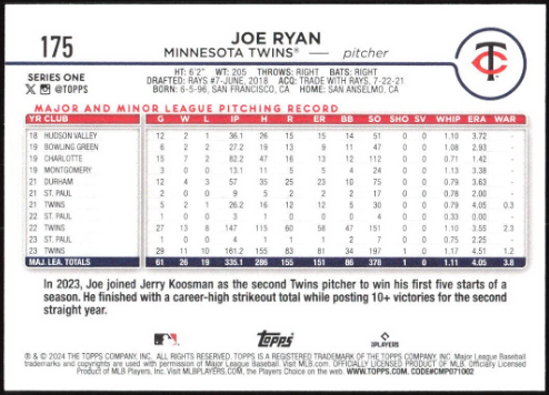
In 2024, Topps utilized a neon-sign-type look for the large team name at the top. It is set against a black border and has a distinctive look that works well. The black border fades to white as it moves down each side of the card. Topps’ big team name on the top of card fronts is not new (see below), but is quite handsome this time around. (It makes up for the “same-old-thing” card backs.)
2023 Topps
……………………………………………………….
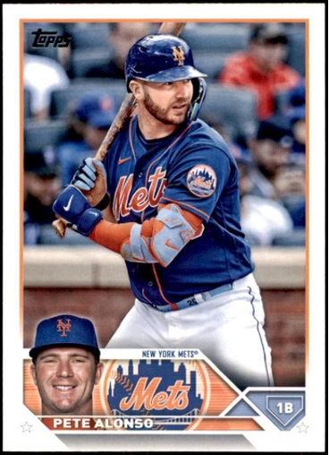
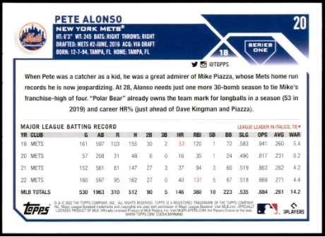
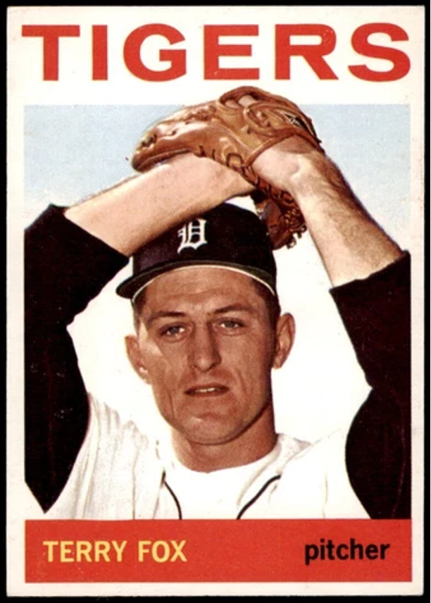
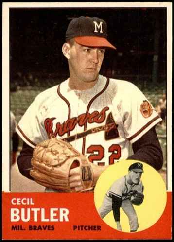
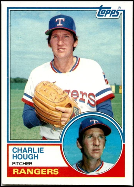
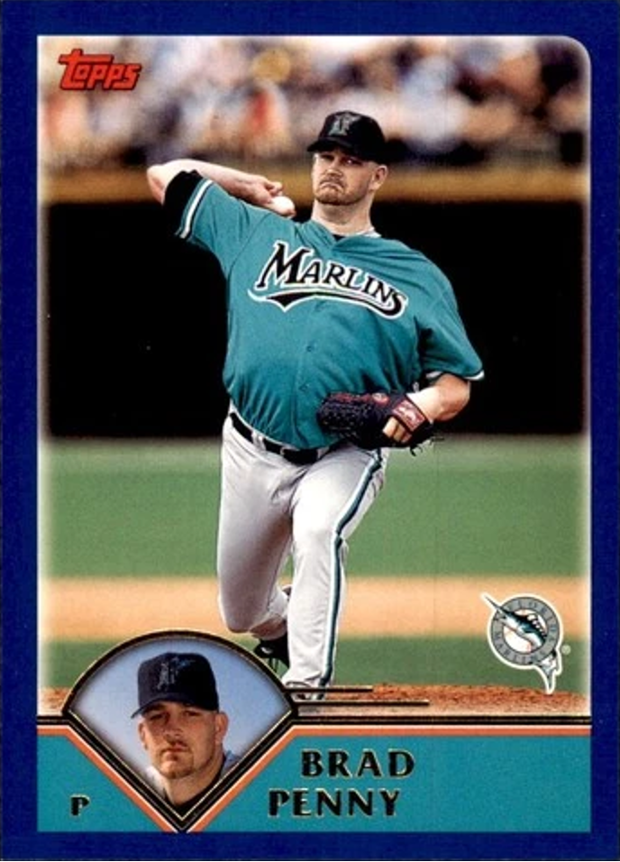
I have to say, I’ve liked all four set designs throughout the decades when Topps used a second, small photo on one of the lower front corners. It began in 1963 and the company has used it every 20 years since … in 1983, 2003 and 2023 (see below). Each time the second-photo design has been used it’s been slightly different. In 1963, a black-and-white photo in a circle was utilized. Then in 1983, the photo-in-a-circle was in color. In 2003, the circle became a baseball diamond-shape. Finally, in 2023, the photo was cropped and shown by itself (not inside any kind of shape). The 2023 Topps cards look fabulous. The photo along with the team logo and some geometrics on the front bottom is a bit cluttered, but still works well. As usual, card backs are pretty much just straight-forward stats.
……………………………………………………….
Have some “BaseballCardFun” and check out front and backs from different sets, years and eras. Read the stats on card backs and compare players. Even if many cards from Topps recent flagship sets don’t gain much in value, you can still get plenty of enjoyment from them.
• • • • • •
THIS ARTICLE WAS WRITTEN
EXCLUSIVELY FOR BaseballCardFun.com
• • •
Text Copyright © 2026 by BaseballCardFun.com / Mark A. Larson
No article appearing on this website may be reproduced without written consent of the Editor/Publisher
