
BY MARK A. LARSON
Quick. As the 1990s draw to a close, name the one word that best describes Topps’ baseball card sets of the past decade. How about “change?”
After all, during the last 10 years, Topps scrapped its dull, lifeless gray cardboard in favor of bright, white, glossy UV-coated stock. Those massive 792-card sets dwindled to the smallest Topps regular sets in nearly 40 years.
Cards issued in series reappeared after a 20-year hiatus. Inserts became nearly as important as the regular set for many collectors. The wax pack disappeared. And possibly the biggest Topps change of all? (We’ll tease you like the TV news does and leave that for the end of this article.)
Let’s look at the designs of each Topps regular set issued during the 1990s. We’ll rate them on a 1-10 scale (1 being atrocious, 10 being superb).
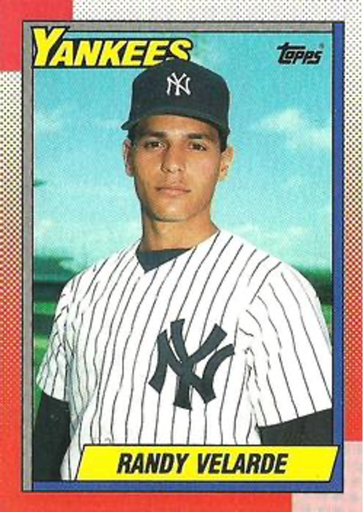


1990: These were perhaps the most colorful card fronts since the 1975 set – and pretty good-looking too. Borders contained six different colors or shades and the photos seemed sharper than the previous year. Backs had a putrid yellow on gray cardboard. This was the ninth straight year Topps issued a 792-card set … a number which would continue through 1994. (Rating = 6)
1991: This was Topps’ 40th Anniversary set and a special logo appeared on card fronts. Borders are white, with photos framed in various colors. Not a bad design, but not particularly interesting either. Backs were the same old thing, except they had pink on gray cardboard. (Rating = 4)
1992: The front design is somewhat similar to the ’91s, except less innovative. What saves this Topps set from oblivion is the return to white cardboard backs for the first time since 1970. Backs feature full color, including photos of the player’s home stadium. This improved cardboard stock makes for shinier fronts too. (Rating = 4)
1993: Another improvement in card stock that is glossier gives Topps the opportunity to add a second quality photo on card backs. Speaking of card backs, these are the best yet for a Topps set. Fronts are simple, yet seem refreshing, not dull. This was the year Topps returned to the series format, issuing two series of 396 cards each. Sets issued in series would continue through 1999. (Rating = 8)
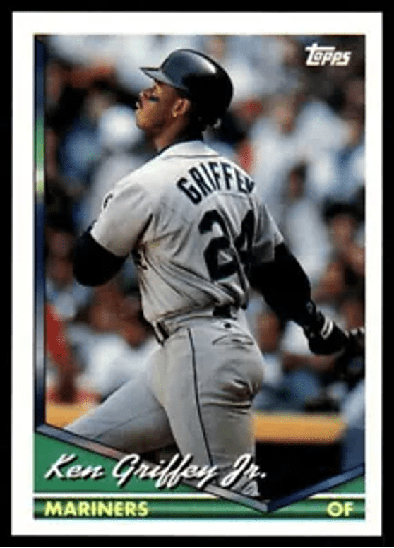
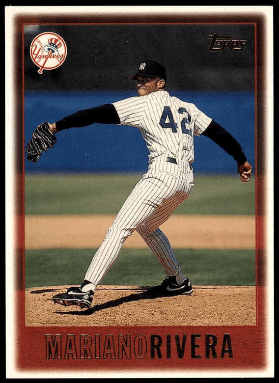
1994: Pressure from the other card companies continued to force Topps to upgrade its product. The 1994 set features cards that are UV-coated – front and back – producing an even glossier shine. Another fairly simple card front design and color scheme is effective. The second photo on card backs was again used and would be throughout the rest of the decade. (Rating = 8)
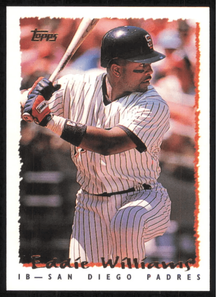
1995: Topps made two major changes in ’95. Gold foil stamping appeared on card fronts for the first time. And the size of the set shrunk to 660 cards, the smallest Topps set since 1977. Card fronts were white-bordered, with the photo itself having a ragged-edge design, which is sort of annoying. Photos have a dreary feel to them. (Rating = 5)
1996: The look of the ’96 set is much better than the previous year. There is a second, small black-and-white photo on card fronts that is effectively used. Plus, the color photos themselves seem brighter. Gold foil stamping returns and will be used for the rest of the ’90s. At 440 cards, this was the smallest Topps set since 1957 (even though there were a dozen more major league teams in ’96). The Mickey Mantle reprint insert cards issued with this set helped rejuvenate interest in Topps. (Rating = 8)
1997: In some ways, the ’97 Topps card design reminds one of the ’95s. The photo inside the white border again has a ragged edge, but it is less pronounced this time (and therefore less offensive). By 1997, most of Topps’ card backs were pretty much the same. Set size was increased to 496 cards. Like the Mantle cards the previous year, Willie Mays reprint inserts were cool. (Rating = 6)
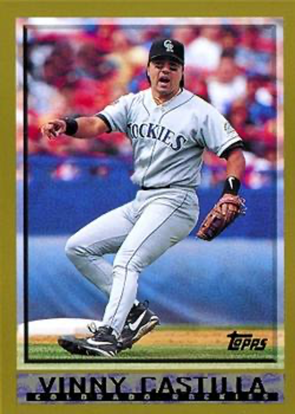
1998: For the first time since 1990, Topps used a border color other than white. This time it was sort of a tannish/light brown, which successfully blended with the gold foil stamping. In the background behind the player’s name in gold are small, subtle team logos. It was a nice departure from six consecutive white-bordered sets. The set remained small at 503 cards and featured Roberto Clemente on reprint inserts. (Rating = 8)
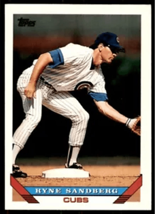
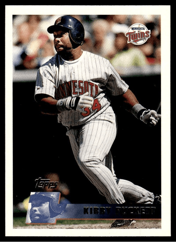
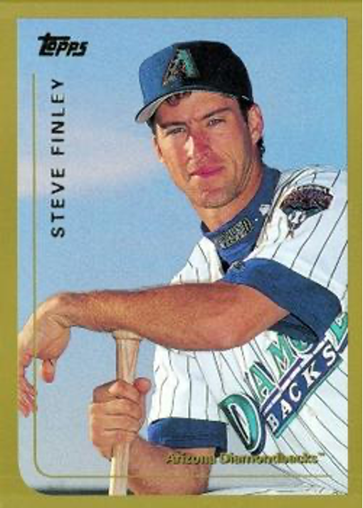
1999: As innovative as the ’98s were, Topps totally dropped the ball in 1999. They repeated the same border color, with an unimaginative, boring front design. It’s almost as if they had extra card stock left over from last year that they had to use up. The only neat thing about this set is the 70 different Mark McGwire cards issued to commemorate his record-setting 70 home runs. (Rating = 2)
Topps played catch-up throughout the 1990s. Most of the new ideas on its cards were innovations already used by other companies. That might explain why no single Topps set from the decade stands out head-and-shoulders above the rest. After all, in the previous four decades, the 1957, 1967, 1975 and 1983 sets immediately come to mind as eye-poppers.
And the biggest change of all to Topps sets during the 1990s? Sadly, it was the disappearance of those sweet, little pink rectangular slabs of bubble gum. Sniffle, sniffle. Boo-hoo-hoo.
• • • • • •
• Originally Published in Apr. 1999 “Twin Times” •
THIS ARTICLE FROM THE “TWIN TIMES” NEWSLETTER – OFFICIAL PUBLICATION OF THE TWIN CITIES SPORTS COLLECTORS CLUB – IS REPRINTED WITH THE PERMISSION OF THE AUTHOR. IT HAS BEEN RETYPED, BUT NO CONTENT HAS BEEN CHANGED (EXCEPT FOR VERY MINOR ADJUSTMENTS, CORRECTIONS TO ANY TYPOGRAPHICAL ERRORS AND THE ADDITION OF GRAPHICS). COMMENTS OR INFORMATION IN THE ARTICLE MAY BE OUT-OF-DATE.
To keep up-to-date on additions to BaseballCardFun.com, subscribe below*
* Your email address will never be shared and is only used to announce new articles
