
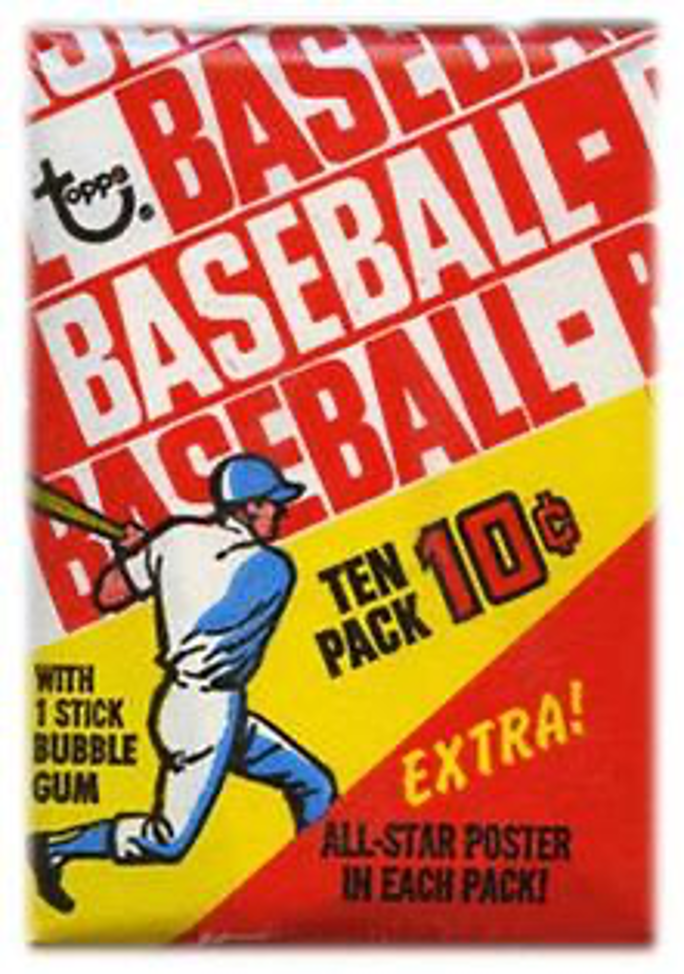
The history of Topps baseball card sets
BY MARK A. LARSON
With the arrival of the new decade, Topps made an abrupt – and welcome – change with the design of its 1970 set.
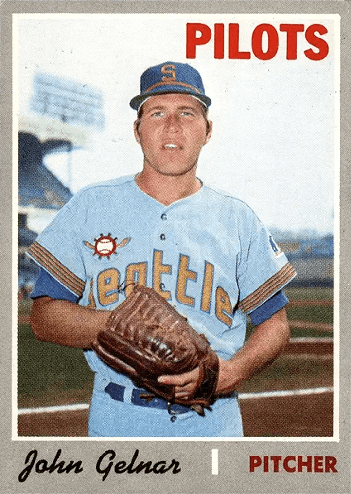
For the first lime in the company’s 20 years of producing baseball cards, Topps utilized a gray border. Another first was the use of script lettering on card fronts for players’ names.

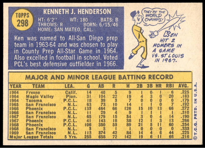
The horizontal backs featured blue and yellow colors on white cardboard. The last time two colors were used on card backs was 1959. Until 1992, the 1970s were the last major Topps set to use white cardboard stock.
At 720 cards, the ’70 set was Topps’ largest up until that time, far surpassing the previous record 664-card set issued the year before. Fortunately, nearly all the additional cards featured individual players – unlike later, larger Topps sets where the company added a host of specialty cards (boyhood photos, in-action cards, etc.).
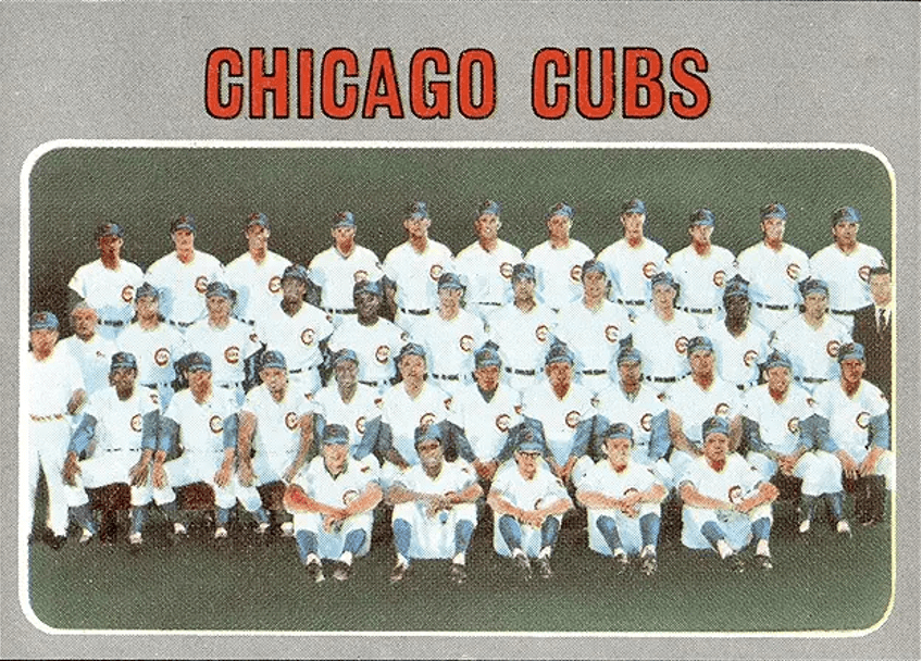
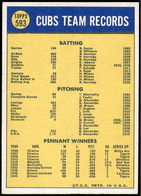
After a one-year hiatus, team cards returned in 1970. Backs featured lists of seasonal and all-time franchise leaders for the first time. This enabled collectors to see and compare team leaders in each offensive and pitching category with their favorite stars of 1970. Often the comparisons were eye-opening … such as Hack Wilson’s seasonal Cubs record of 190 RBls, or Walter Johnson’s 416 lifetime wins for the Senators.
The familiar multi-player star cards were missing from the 1970 set. Cards with colorful titles like “A’s Big Armor” and “Tribe Thumpers” were nowhere to be found.
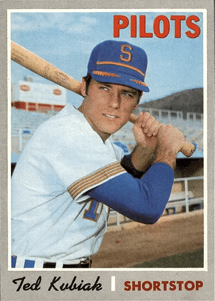
Only days before the ’70 baseball season opened, the Seattle Pilots moved to Milwaukee and became the Brewers. Since Topps had already printed Pilots cards for the 1970 set’s early series, it wisely elected not to change over to the Brewers team designation for players in the later series. Had they done this, airbrushed cards would have abounded. As it happens, perhaps the best thing about the 1970 set is its relatively low number of airbrushed cards and recycled old photos (unlike 1968-69).

Collectors have differing opinions on the 1970 cards’ gray borders. Some find them drab and unappealing, others admire the attempt by Topps to do something different. After all, in 1970 gray borders were still a novelty.
Yet, no matter how the gray borders grab you, the ’70s arguably feature the best photography since the classic 1967 set. And that’s no small feat.


• • • • • •
See related article on BaseballCardFun.com entitled:
“BASEBALL HOBBY NEWS — Interesting Cards and Subsets in the ’70 Set”
Click Link Here
• Originally Published in July 1992 “Baseball Hobby News” •
THIS ARTICLE FROM “BASEBALL HOBBY NEWS” MAGAZINE IS REPRINTED WITH THE PERMISSION OF BOTH THE EDITOR/PUBLISHER AND THE AUTHOR. IT HAS BEEN RETYPED, BUT NO CONTENT HAS BEEN CHANGED (EXCEPT FOR VERY MINOR ADJUSTMENTS, CORRECTIONS TO TYPOGRAPHICAL ERRORS AND CHANGES TO GRAPHICS). COMMENTS OR INFORMATION IN THE ARTICLE MAY BE OUT-OF-DATE.
To keep up-to-date on additions to BaseballCardFun.com, subscribe below*
* Your email address will never be shared and is only used to announce new articles
