
BY TROY KIRK
Most of the companies that have issued baseball cards have included a company logo or some type of identification on the cards to let the world know their identity.
These identification marks can be as simple as the company initials in small type, or as elaborate as a picture of a product taking up the entire back of the cards. When used creatively, company logos can add a great deal to the appeal of a card set.
The best use of company logos on baseball cards tends to come from businesses using cards to promote other products, rather than from those corporations that sell baseball cards as their main product.
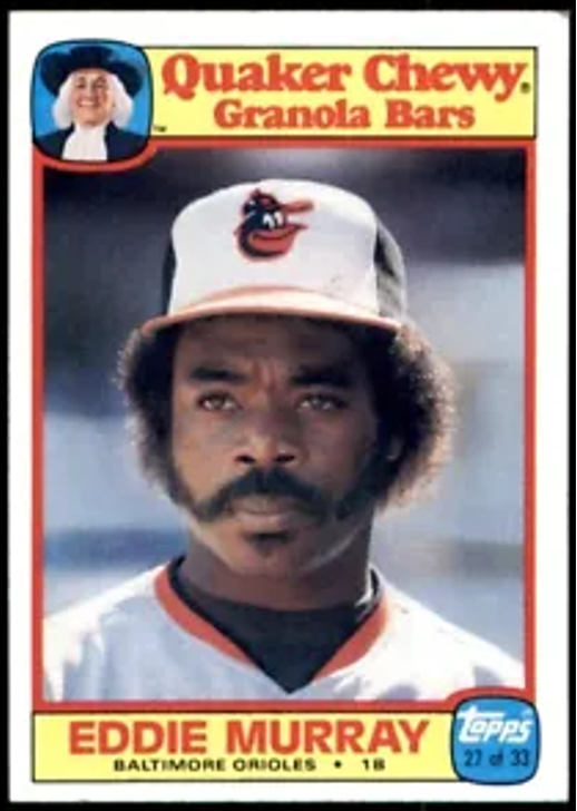
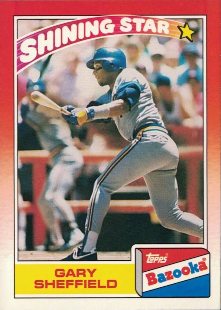
For example, it’s more interesting to see the Quaker Oats Man on a baseball card than it is to see the Donruss logo. Occasionally the baseball card companies get creative with their use of company logos, such as the 1988-90 Bazooka cards from Topps picturing a package of Bazooka gum on the front, but this seems to be the exception rather than the rule.
Here’s a rundown of my picks for the top 10 baseball card sets with prominent company logos:

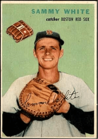

1 — 1954 WILSON WIENERS
The only card set that has become a cult classic because of its company logo, the Wilson Wieners cards of 1954 are the obvious winners. On each card, a small package of Wilson Wieners hangs suspended in the air next to the player pictured. There was absolutely no attempt to be subtle in the placing of the wiener package on the cards, and this gives the cards a uniqueness, bizarreness, and sense of fun not found on any other baseball card set.

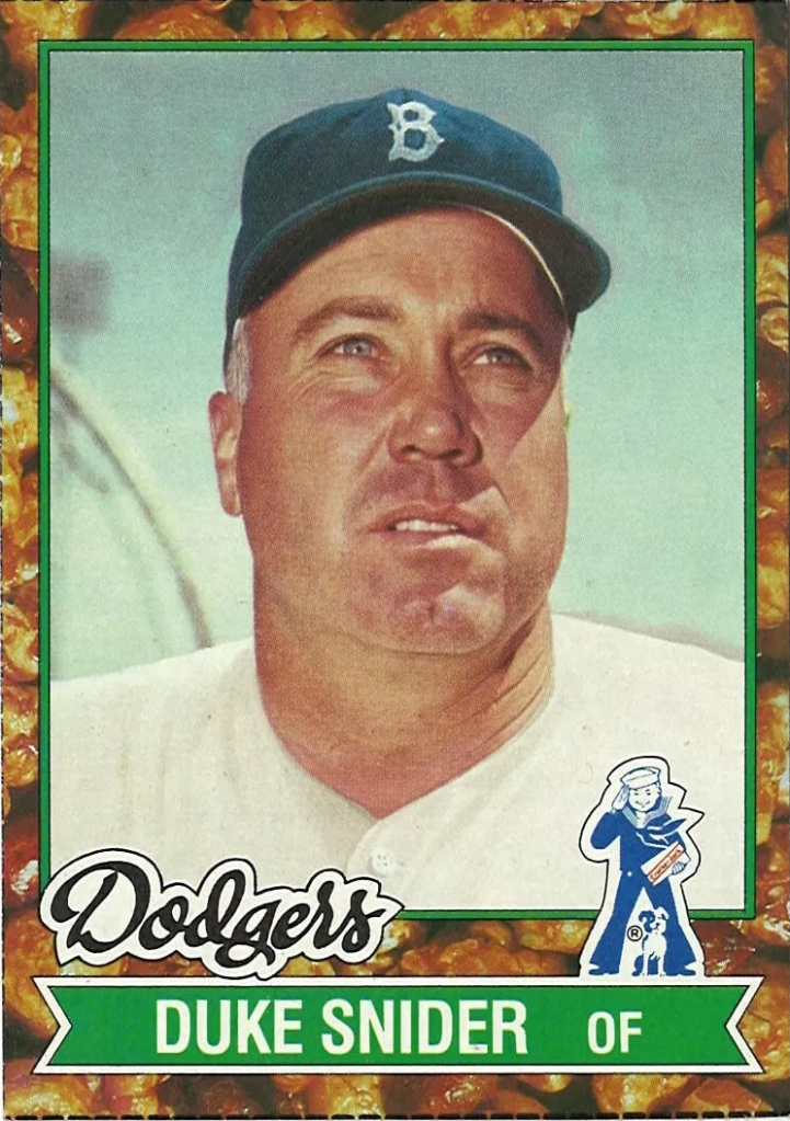
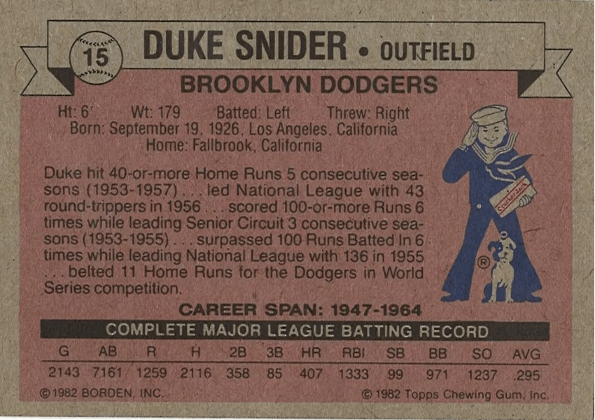
2 — 1982 CRACKER JACK
The Cracker Jack cards of 1982 contain the normal Cracker Jack logo of a sailor and a dog on the card fronts and backs, but what really sets these cards apart is the border that pictures actual pieces of Cracker Jack candy. This was a great way to advertise the company’s main product while giving the collector an interesting artistic design.
The only disappointing thing about these cards is that they were not inserted in packages of Cracker Jack, but were issued as 9-card panels to promote the first Cracker Jack Old-Timers baseball game.
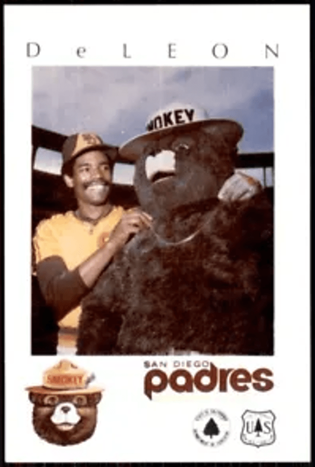
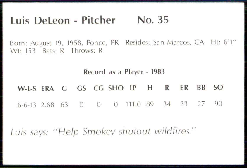
3 — 1984 SMOKEY
When the U.S. Forest Service sponsored some baseball card sets in the mid-1980s, they used their symbol of Smokey Bear to great effect. They introduced their 1984 San Diego Padres set with a card showing an enlarged version of the Smokey Bear logo.
Then, in addition to displaying the Smokey logo on each card, they actually had someone in a Smokey Bear suit pose with the players.
One nice thing about the 1984 Padres set is that the individuals depicted were allowed to have fun with Smokey. Kurt Bevacqua is shown sitting on Smokey’s lap, umpire Doug Harvey is signaling safe while Smokey is displaying the out sign, and coach Norm Sherry is showing Smokey a pitching grip. There is even a card of The Famous Chicken giving Smokey a kiss.
There have been a number of other U.S. Forest Service card sets in the past few years, and they have almost always used Smokey to good effect. For example, the 1987 Angels, Braves, Cardinals, and Rangers sets all show different drawings of Smokey on the card backs in different action situations. The card backs help tie all these sets together, and the different drawings of Smokey helps to distinguish them from one another.
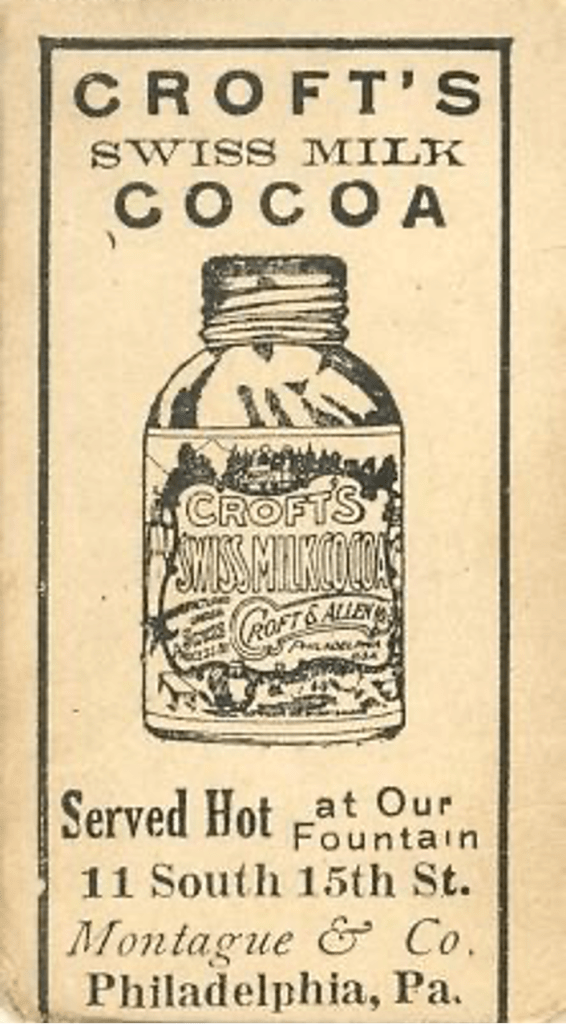
4 — E92 CROFT’S COCOA
The E92 set from the 1910 era was issued with several different back designs, including advertisements for Dockman’s Gum, Nadja Caramels, and Croft’s Cocoa.
The E92 cards with Croft’s Cocoa backs have the nicest design, as they feature a bottle of Croft’s Swiss Milk Cocoa over most of the back, along with an invitation to come and have some hot cocoa at their store in Philadelphia. There is even a street address listed for the store, giving these cards a personal touch not found on many baseball card issues.
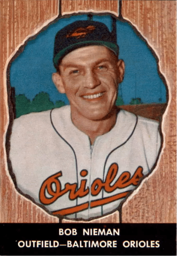
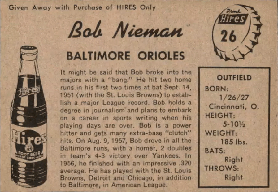
5 — 1958 HIRES ROOT BEER
The 1958 Hires Root Beer cards use Hires logos to good effect on the card backs. There is a large bottle of Hires Root Beer on the left side and a Hires bottle cap in the upper right corner of the back. In a nice touch, the card number is placed in the middle of the bottle cap.
These cards also feature a beautiful and innovative front design with a player seen through a knothole border. It’s kind of a shame that Hires only put out this one regular baseball card issue, as they used a lot of care to make it a quality effort.
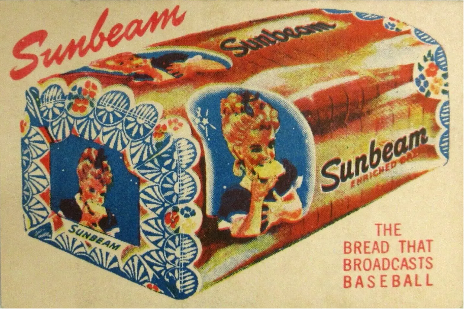
6 — 1947 SUNBEAM BREAD
The 1947 Sunbeam Bread cards are an obscure minor league set representing players from the Pacific Coast League, with a beautiful full-color drawing of a loaf of Sunbeam bread displayed across most of the back.
A slogan next to the bread states “The Bread That Broadcasts Baseball.” This meant that Sunbeam was a sponsor of baseball radio broadcasts at that time. This may be the only set with full color backs and black-and-white fronts, as their advertising was apparently more important to them than the baseball player picture.
Bread manufacturers seem to want to display pictures of their bread on the cards they issue, as several other bread loaves can be found on baseball cards. Other card issues displaying bread loaves include the 1947 Tip Top set, the 1947 Bond Bread set, and the 1946-50 Remar sets.
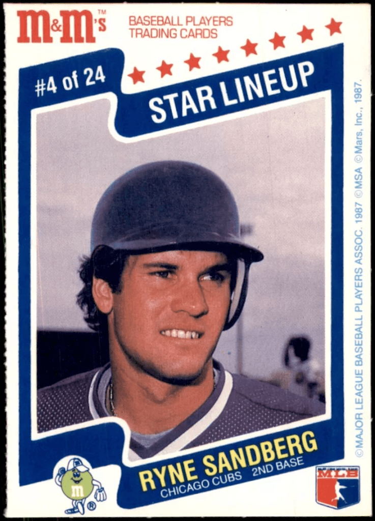
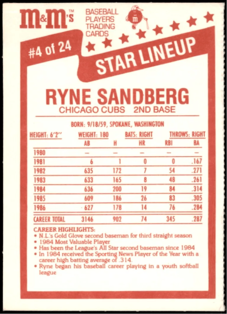
7 — 1987 M&M’s
The 1987 M&M’s cards feature M&M characters on both the front and back dressed up like baseball players. The card fronts contain a green M&M with a fielder’s glove in a throwing position and the backs display a red M&M posing with a baseball bat. It’s always fun to see a company go to the effort of conforming their corporate symbols to a baseball setting for a baseball card issue.

8 — T211 RED SUN CIGARETTES
The T211 Red Sun Cigarettes issue from the 1910 era pictures minor league players from the Southern Association with a great company logo on the card backs. These cards were inserts in Red Sun Cigarette packages, and they feature a bright red sun blazing across the card backs. It is a colorful and interesting logo, and it adds to the appeal of the cards.
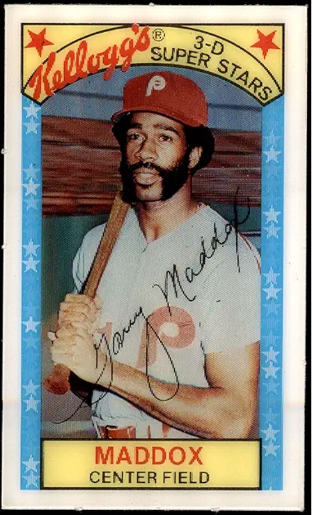
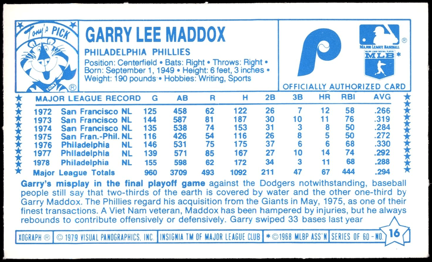
9 — 1978-79 KELLOGG’S
The Kellogg’s 3D sets from the 1970s and early 1980s featured colorful and interesting cards, but they were usually very conservative when it came to company logos.
In the later years of the promotions, they decided to add to the fun of the cards by letting some of their cartoon characters appear on them. Their best logo efforts were the 1978, 1979 and 1981 sets, when Tony the Tiger appeared on card backs. In 1978 and 1979, the words “Tony’s Picks” appear beneath the drawing of Tony.


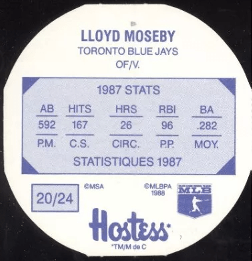
10 — 1988 HOSTESS POTATO CHIPS EXPOS
There are two little creatures found on the fronts of the 1988 Hostess Potato Chips Expos cards. They are apparently a symbol of Hostess, a Canadian company. They are goofy-looking little guys, possibly representing potato chips with faces and other human characteristics. These creatures are a fun addition to the cards.
Kahn’s Wieners gets the award for the dumbest use of logos in baseball card sets. Many of the sets put out by Kahn’s Wieners in the 1960s contained a very attractive logo of a rose with the Kahn’s name on it. The problem with these cards is that there is a dotted line separating the player photo portion of the card and the logo portion. These cards were designed to be cut along the dotted line, thereby eliminating the flower logo from the card. Sadly, the majority of Kahn’s cards are found today with the logo clipped off.
• • • • • •
• Originally Published in Mar. 1991 “Baseball Hobby News” •
THIS ARTICLE FROM “BASEBALL HOBBY NEWS” MAGAZINE IS REPRINTED WITH THE PERMISSION OF BOTH THE EDITOR/PUBLISHER AND THE AUTHOR. IT HAS BEEN RETYPED, BUT NO CONTENT HAS BEEN CHANGED (EXCEPT FOR VERY MINOR ADJUSTMENTS, CORRECTIONS TO TYPOGRAPHICAL ERRORS AND CHANGES TO GRAPHICS). COMMENTS OR INFORMATION IN THE ARTICLE MAY BE OUT-OF-DATE.
To keep up-to-date on additions to this
website, subscribe at bottom of this page*
* Your email address will never be shared and is only used to announce new articles
