
A year-by-year review of Topps’ Greatest Decade
BY MARK A. LARSON
The 1960s truly were Topps.
Many ex-hippies and aging baby-boomers look back at the 1960s with a somewhat wistful feeling of nostalgia. Older folks cringe as they remember revolutionaries, riots, peace marches, the Cold War and the assassination of JFK.
But this is not about Flower Power, Rowan and Martin’s Laugh-In, Bob Dylan, long hair, Vietnam, the generation gap or trips that didn’t require a mode of transportation.
No, for our purposes, the 1960s form the basis for a discussion of baseball card sets from that decade. In my opinion, the period from 1960-69 represents the heyday of Topps’ baseball cards.
Except for a brief challenge by Fleer early in the decade, the name “Topps” and baseball cards in the ’60s were nearly synonymous.
Let’s take a look at the sets and card designs from that decade …
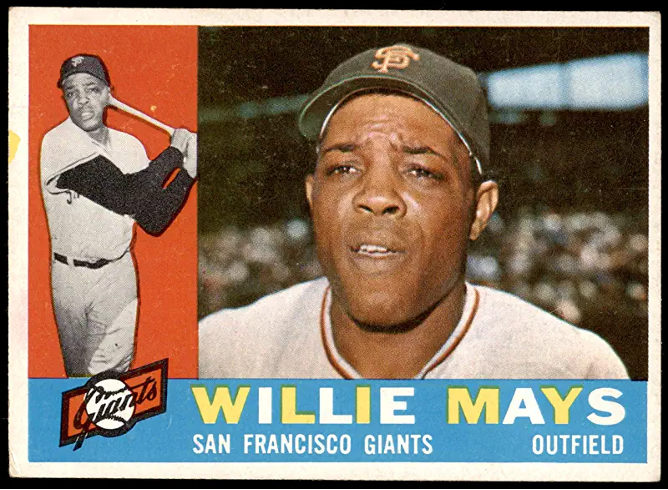
1960
THE HORIZONTALS (1960): The 1960 Topps set was the last major issue to feature horizontal fronts. Topps had used this format before with the 1955 and 1956 sets, but never with a standard-size (2 1/2 by 3 1/2-inch) set. The card design isn’t anything exciting, but it was vastly different from the previous three sets, 1957-59.
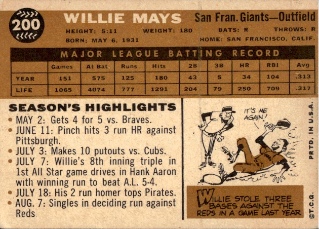
I particularly like the backs. Although I prefer complete year-by-year stats, the “Season’s Highlights” section is a neat recap of that player’s 1959 season. The gold color used on the card back is also attractive.
The 1960 set is notable for a few firsts. The World Series subset appeared for the first time – highlighting the 1959 Fall Classic between the Chicago White Sox and Los Angeles Dodgers. Also making their debut were subsets of managers and coaches cards. The coaches cards are pretty ugly since it looks like each was just beheaded by a guillotine.
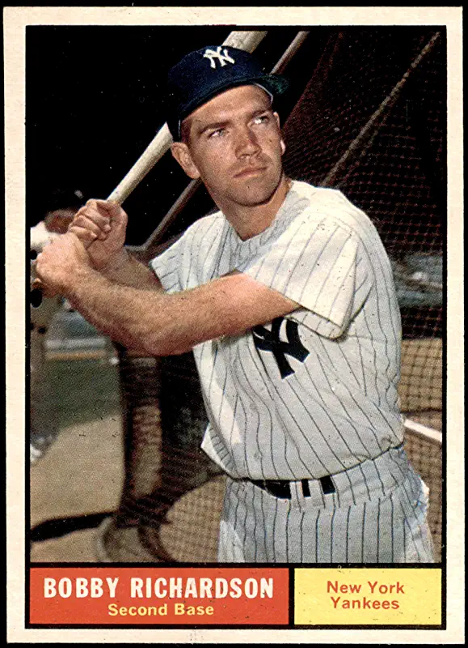
1961
JUST PLAIN PLAIN (1961): The fronts of the ’61 set might just be the plainest card design in the past 30 years. When I was younger, I never liked them. Now, however, the dull design has somehow endeared this set to me.
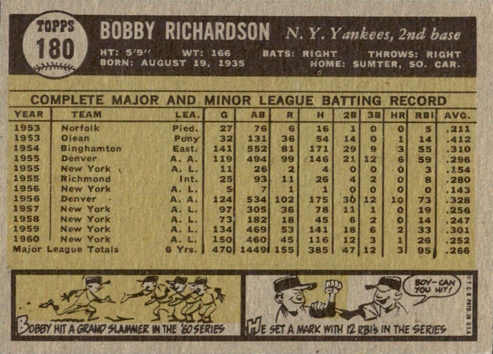
The gray, green backs are also boring, but I like them too. For two reasons: They include complete stats and feature not one, not two, but three cartoons. I’ve always enjoyed Topps’ early cartoons.
Topps was still innovating in 1961. That year’s set featured League Leaders cards for the first time, separate, numbered checklists and an MVP subset. Although most kids hated getting checklists, it meant team cards could now carry relevant stats, instead of checklists on the back.
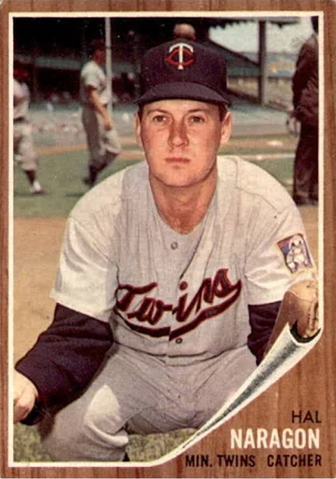

1962
THE WOODIES (1962): The 1962s are best known for their simulated woodgrain borders and “curling corners” on the front. (They reminded me of the paneling in our family room years ago … without curly corners.) I didn’t like this set when I was a kid, and to this day I still don’t.
I think it’s because dark borders, mostly dark photos, plus a very dark back make it all seem so gloomy. At least the ’61s had white borders and multi-colored boxes with the player’s name and team on the front.
The single year and lifetime stats on the reverse of the card aren’t too exciting either. Topps did spruce up the set by including a subset salute to Babe Ruth, multi-player “Rookie Parade” cards, and a series of In-Action cards featuring titles such as “Killebrew Sends One Into Orbit.”
Most nauseating of all, though, was the way Topps put ads on the back of 7th series cards for its 1962 football set. Tacky. Tacky. Tacky.
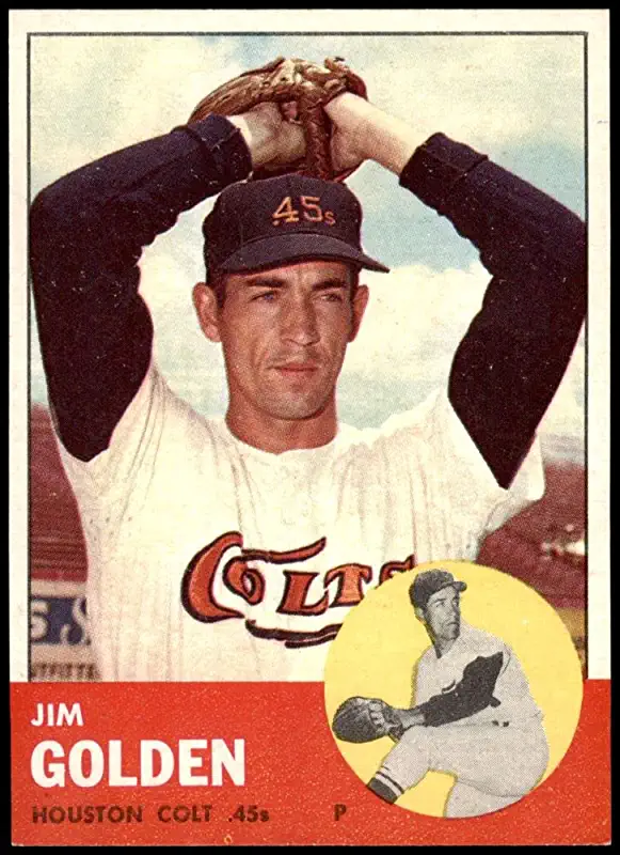
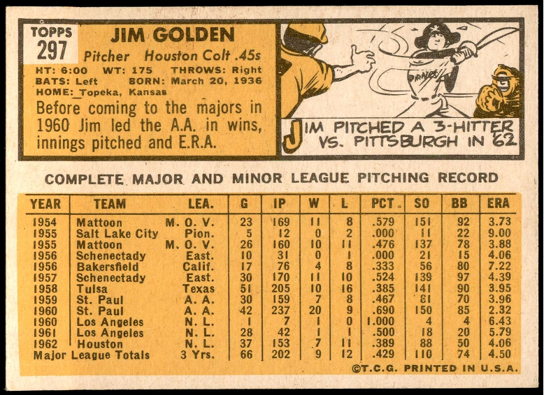
1963
YOU LIGHT UP MY LIFE (1963): The 1963 set was certainly a breath of, you guessed it, fresh air. Just compare the looks (both front and back) of the ’63s with the ’62s. It really is the difference between sunshine and fog.
The ’63s feature bright photos on the front, white borders, colorful boxes with the player’s name and a smaller, second front photo. (This was the last time a second front photo would be used for 20 years.) The backs are just as good: White cardboard stock, a bright yellow color scheme and some of the best cartoon artwork Topps has ever had.
This set really marks the beginning of a new era for Topps. During the company’s first 12 years (1951-62) of baseball card production, most sets featured basically dark, drab photos and dull designs. The ’63 set leads off what I consider the best five-year period in Topps history … 1963-67.
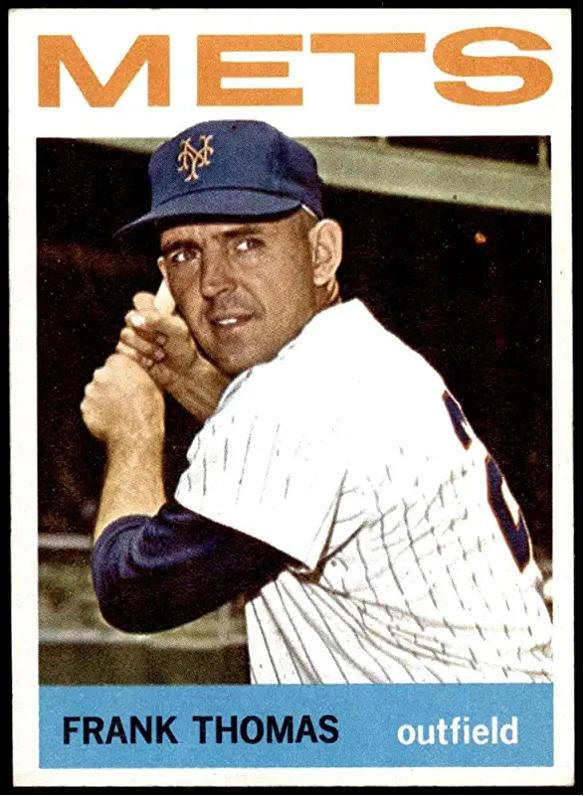
1964
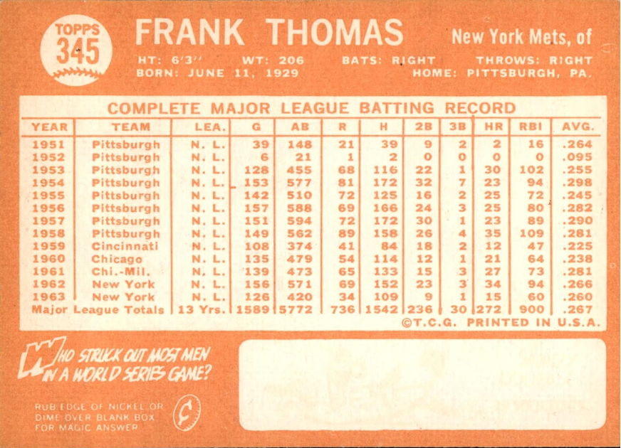
NICKEL ’N DIME RUB (1964): Two things make the 1964 set stand out. This was the first time Topps used the large team name on the front. It has been used so many times since (1967, 1971, 1972, 1975, 1977, 1984, 1985, 1986 and 1988) that it’s almost become a Topps trademark. When you see the large team name, you think Topps.
Secondly, this was the only baseball card set that Topps used a “coin-rub” gimmick on the back to reveal a cartoon. (“Rub edge of nickel or dime over blank box for magic answer,” the instructions read. Pssst … I’ll let you in on a secret. A penny worked too.)
The ’64s are very nice. They continued the style begun a year earlier – bright photos and colorful backs. The orange print on the back is a bit hard to read, but that’s nitpicking.

1965
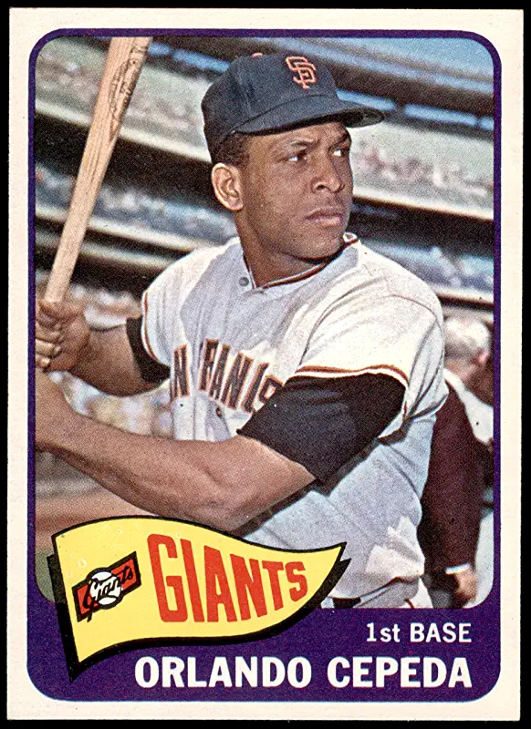
BLUE BACK BEAUTIES (1965): I have always liked the 1965 set. The white borders on the front along with the pennant/team name/team logo design adds greatly to the overall attractiveness of the card. The front design is one of my favorites. This was the last time team logos would appear on the front of a Topps card until 1985. The photography in the 1965 set is good too. Most photos stand out as clean, crisp and colorful.
Blue backs were used for the first time in a major set by Topps in ’65, and I adore them. The blue and white backs give one the feeling of cool freshness. The combination front/back design of the 1965 set is dynamite
1966
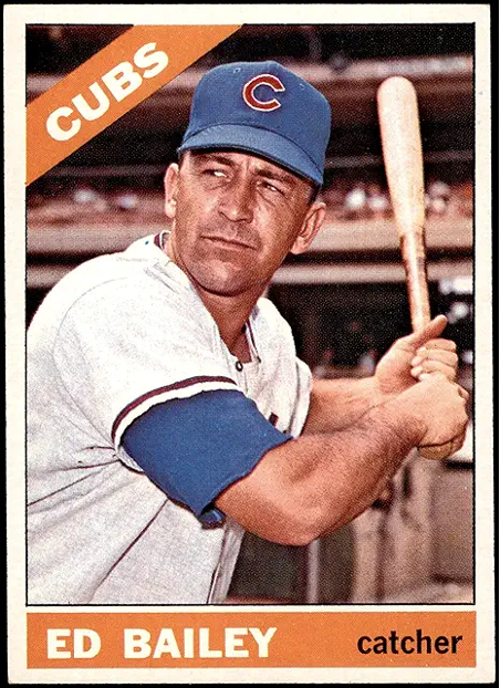
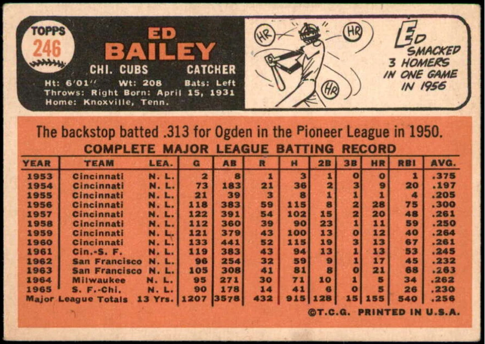
BRIDGING THE GAP (1966): This is probably the weakest of the sets in what I previously described as Topps’ best five-year period. But it serves the purpose, in hindsight at least, of bridging the gap between the beautiful ’65 and ’67 sets.
In its own way, the ’66 set is as bland as the ’61 was a half-decade earlier. The design – both front and back – is basic, boring stuff. While photos are bright, they don’t seem to have the clarity of Topps’ previous efforts.
For some reason, Topps chose not to include a World Series subset in 1966. (It was the only year between 1960-78 the company failed to issue cards highlighting the previous year’s post-season.) And since my beloved Minnesota Twins were in the ’65 World Series against the Dodgers, the lack of this subset is a genuine disappointment.

1967
BEST EVER? (1967): No set Topps has issued in the last 23 years even comes close to the quality design of the 1967 set. The photography represents Topps’ best. The color-coded team names on the bottom front, along with white borders make its appearance dazzling.
The backs feature easy-to-read black print on a green and white background. Two great cartoons enhance the backs – the first vertical backs since 1953.
I’m probably a bit prejudiced since this is the first set I collected as a kid. But I consider it Topps’ finest ever (although the 1963 and 1965 sets are a close second and third). In the year of Sgt. Pepper, Topps hit the right notes with this exquisite set.
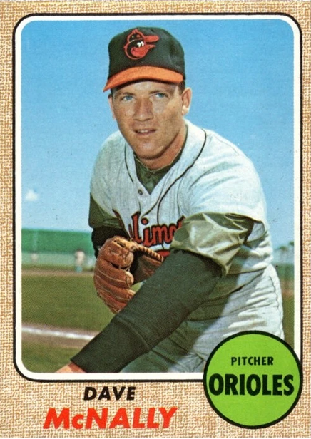
1968
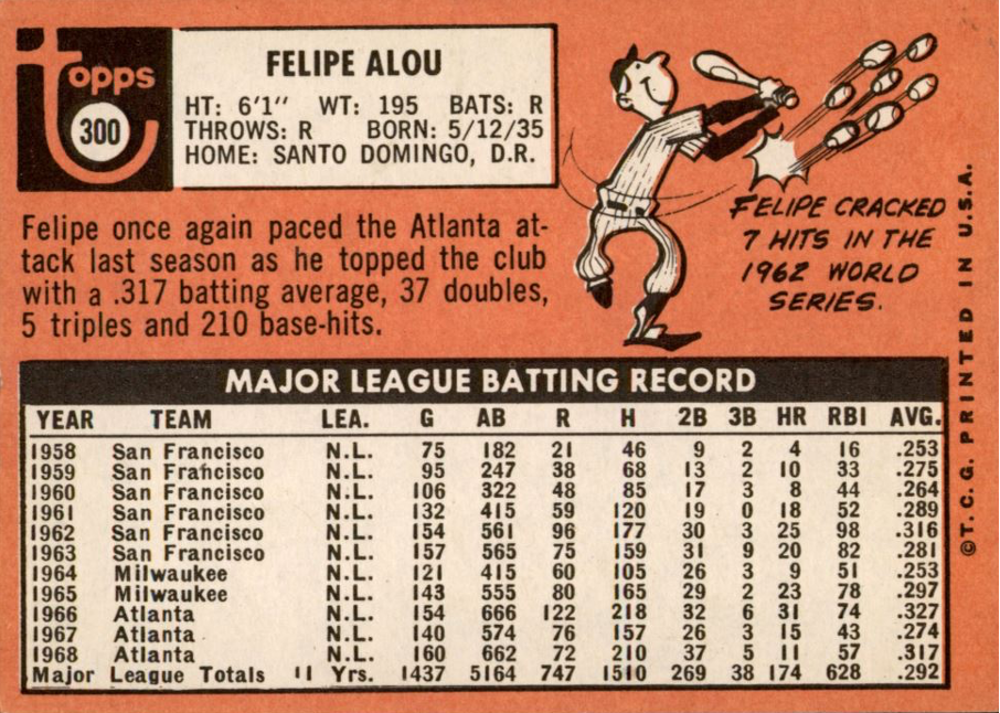
BURLAP SACK SET (1968): This is a big letdown from the ’67s. The fronts feature a light brown border that resembles a burlap sack, the first non-white border since 1962. Photography is not as good as earlier years. And the backs are just a repeat of the ’67s, except the cartoons are placed at the bottom, instead of near the top.
The ’68s are one of Topps’ weakest efforts of the decade. It’s as if the creative minds at the company were just played out. After all, any set following the ’67s was bound to be disappointing.
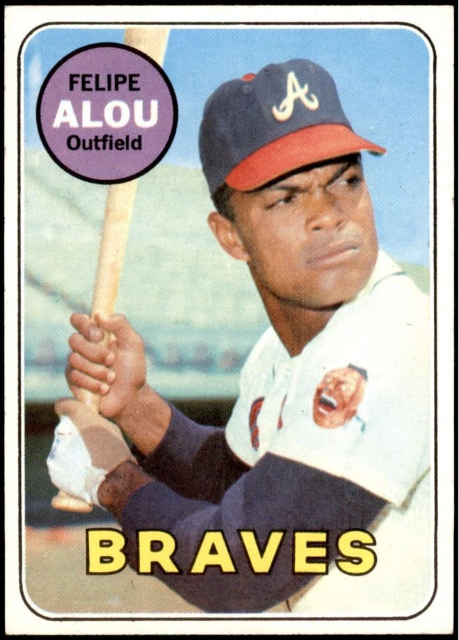
1969
NOT A GRAND FINALE (1969): It would have been nice if Topps had capped off the 1960s with a stunning, innovative set. Such was not the case.
The fronts of the ’69s borrow from both the 1967s (large team name at the bottom) and the 1968s (round colored circle in the corner). The backs remind me of the 1966 set, with their horizontal design and pink and white color scheme.
Thus, the ’69s are really a hybrid design of Topps’ three previous sets. Not only that, but seven dozen photos from the 1967-68 sets were reused in 1969. Topps really was becoming lazy … borrowed designs and borrowed photos. The word that best describes the ’69 set is “stale.”
In general, the 1960s represent the crème-de-la-crème of Topps sets over the past 40 years. Oh, there have been some good sets since … 1970, 1975 and 1983 stand out. And there were beautiful sets in the 1950s … 1952, 1953 and 1955. Yet, the 1960s – especially the mid ’60s – are hard to beat overall.
It was a turbulent decade that spawned many changes, both good and bad. But through it all, there was Topps … churning out set after set of classic cards that to this day help many of us revisit the times when we were eight, 10 or 12 years old. That, to me, is the nirvana of collecting – getting a natural high from childhood memories. Long live the ’60s. The decade that was Topps.
• • • • • •
• Originally Published in Aug. 1990 “Baseball Hobby News” •
THIS ARTICLE FROM “BASEBALL HOBBY NEWS” MAGAZINE IS REPRINTED WITH THE PERMISSION OF BOTH THE EDITOR/PUBLISHER AND THE AUTHOR. IT HAS BEEN RETYPED, BUT NO CONTENT HAS BEEN CHANGED (EXCEPT FOR VERY MINOR ADJUSTMENTS, CORRECTIONS TO TYPOGRAPHICAL ERRORS AND CHANGES TO GRAPHICS). COMMENTS OR INFORMATION IN THE ARTICLE MAY BE OUT-OF-DATE.
To keep up-to-date on additions to BaseballCardFun.com, subscribe below*
* Your email address will never be shared and is only used to announce new articles
