
BY MARK A. LARSON
There is, of course, no right or wrong answer. No black and white, just many, many shades of gray. Each collector is entitled to his or her opinion.
Keeping that in mind, let’s fantasize for a moment. Imagine we’re attending a hobbyist’s dream college: Sports Memorabilia University (S.M.U.). The major course of study is examining the relative pros and cons of “modern” baseball card sets.
It’s final exam time. You have no idea what the instructor is going to ask you to write about on your final essay. All you know is there will be a very limited time period and if he asks you to spell Carl Yastrzemski, Sandy Valdespino or Lou Piniella, you’re dead.
“Uh, oh,” you think to yourself. “He’s passing out the exams. Here it is. I’m doomed, I’m doomed. I knew I should have read more of the cartoons on the back of those 1958 Topps.”
Here, then, is the assignment: In five words or less, describe or state views on each major Topps, Fleer and Donruss baseball card set, 1952-86 …
TOPPS
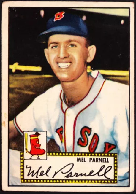


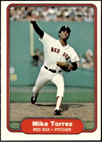
• 1952 Topps: Overall … overrated, oversized, overpriced.
• 1953 Topps: More impressive than the 1952s.
• 1954 Topps: Cockeyed backs.
• 1955 Topps: Horizontal 1954s.
• 1956 Topps: 1955 Xeroxed.


• 1957 Topps: Smaller, darker, grayer, yet handsomer.
• 1958 Topps: Grab the barf-bag.
• 1959 Topps: Rather telescopic, wouldn’t you say?
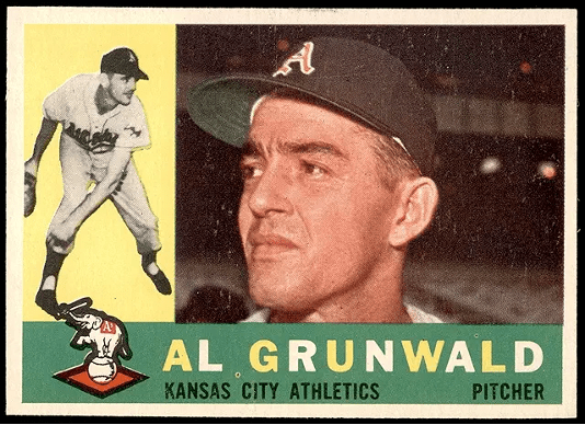
• 1960 Topps: Last of “sideways” sets – yawn …
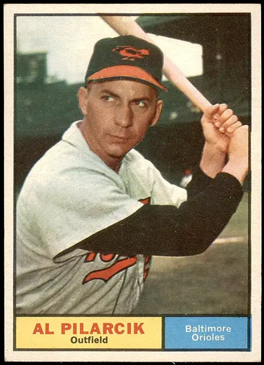
• 1961 Topps: Bland, bland, bland, bland, bland.
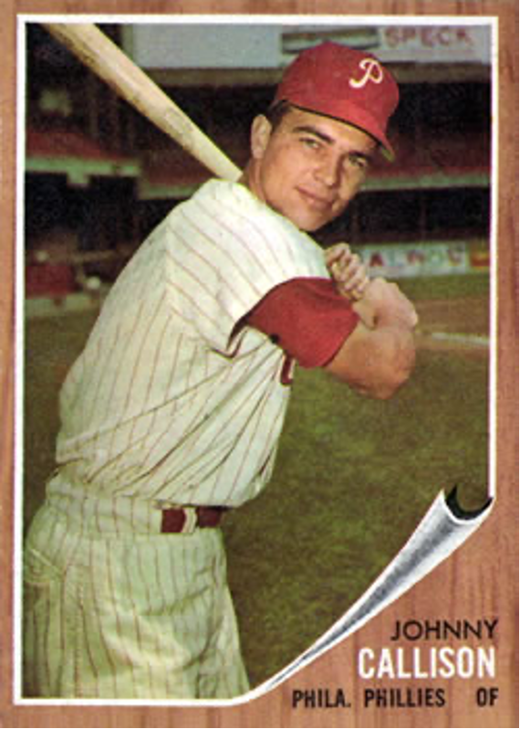
• 1962 Topps: Woodgrain curly corners are attractive.
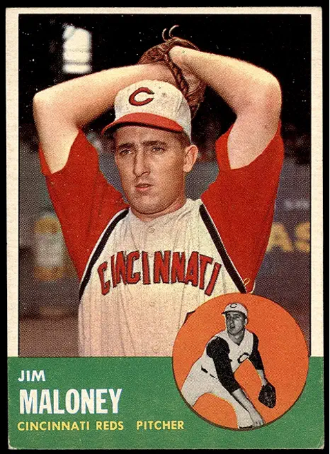
• 1963 Topps: Great fronts, great backs … great.
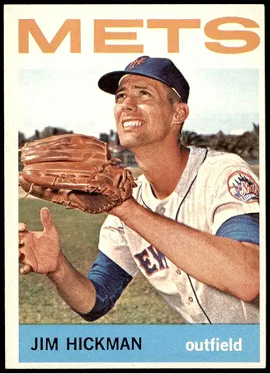
• 1964 Topps: Slight letdown from previous year.
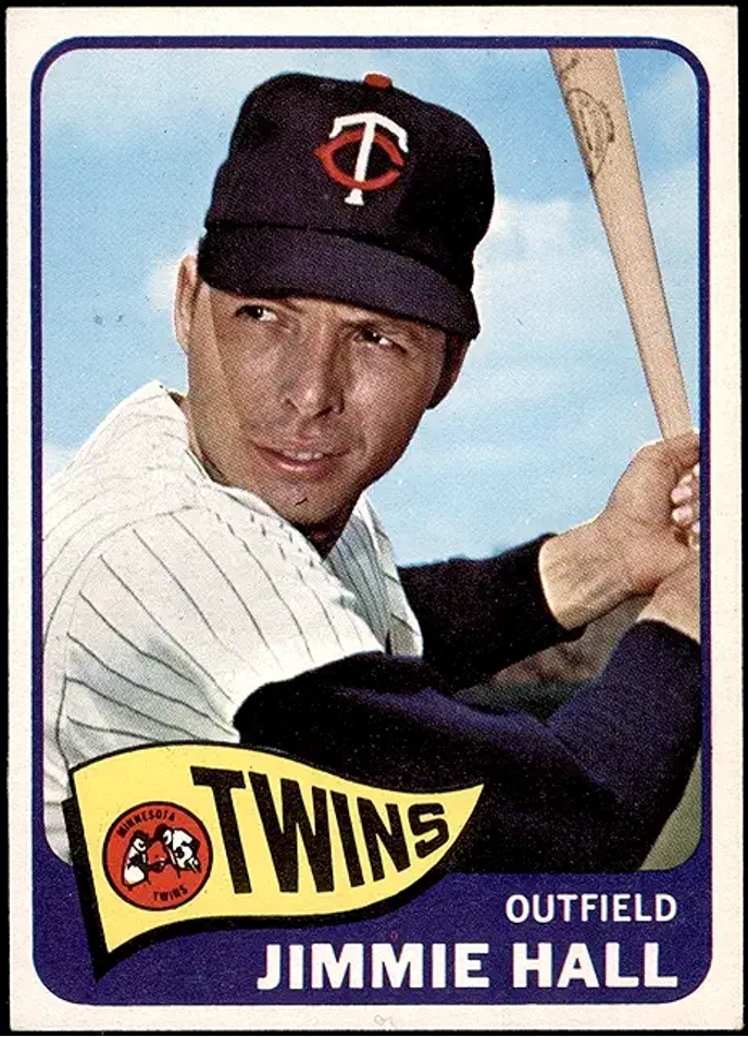
• 1965 Topps: Little heard of, underrated set.
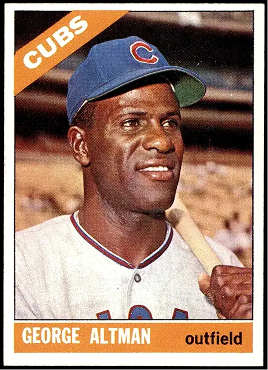
• 1966 Topps: Plain, but pretty.
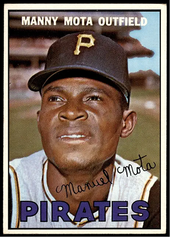
• 1967 Topps: Number one, A-plus, outstanding!
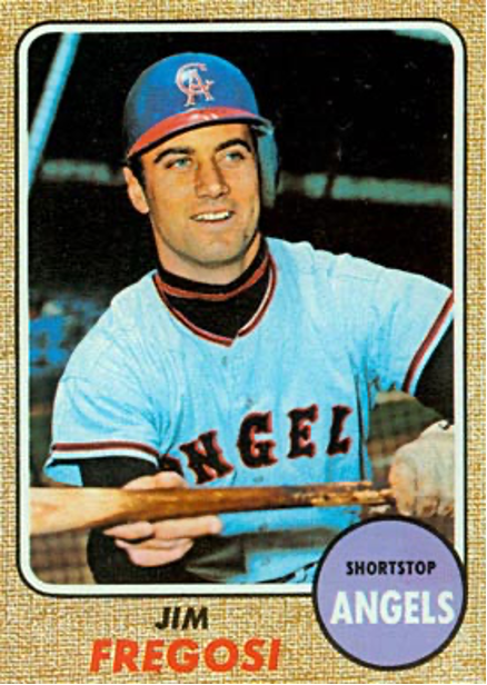
• 1968 Topps: Airbrush artists worked overtime.
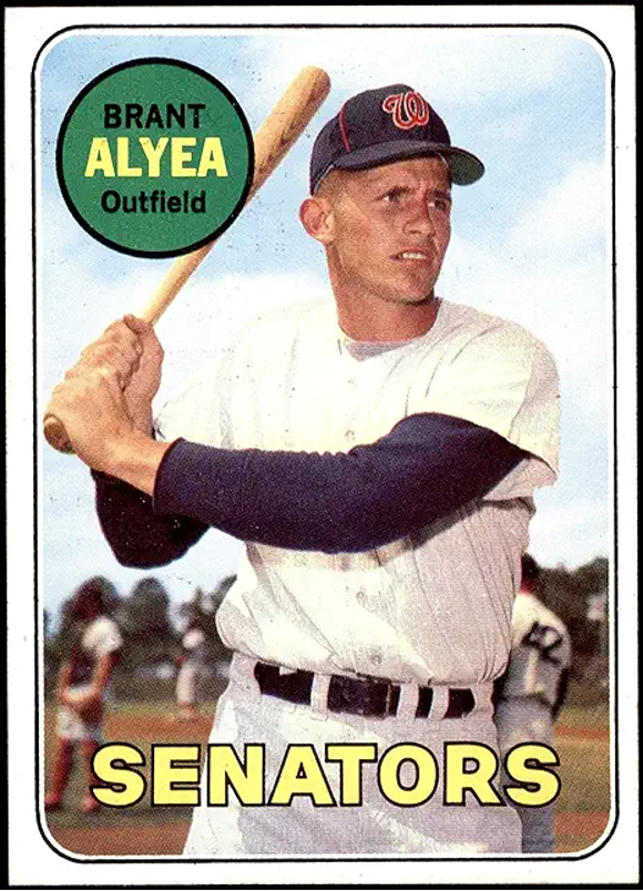
• 1969 Topps: An uninspiring effort.
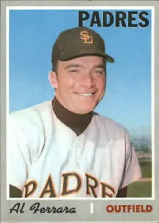
• 1970 Topps: Creative design makes them unique.
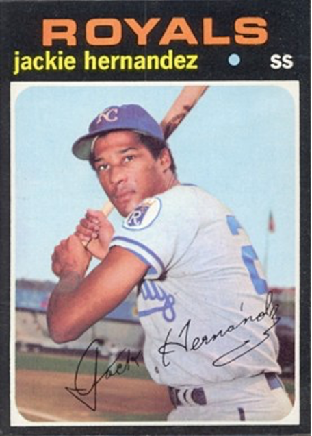
• 1971 Topps: Chip off the old black.
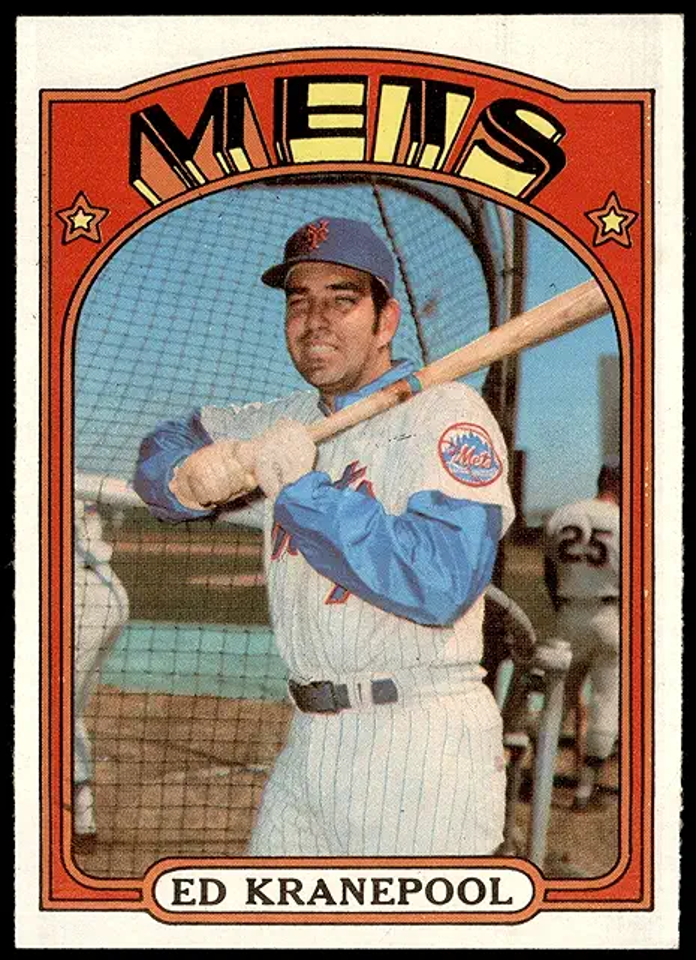
• 1972 Topps: Reminder of the psychedelic era.
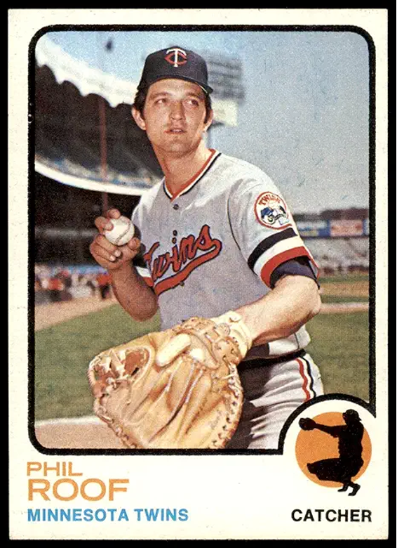
• 1973 Topps: Nice, basic design.
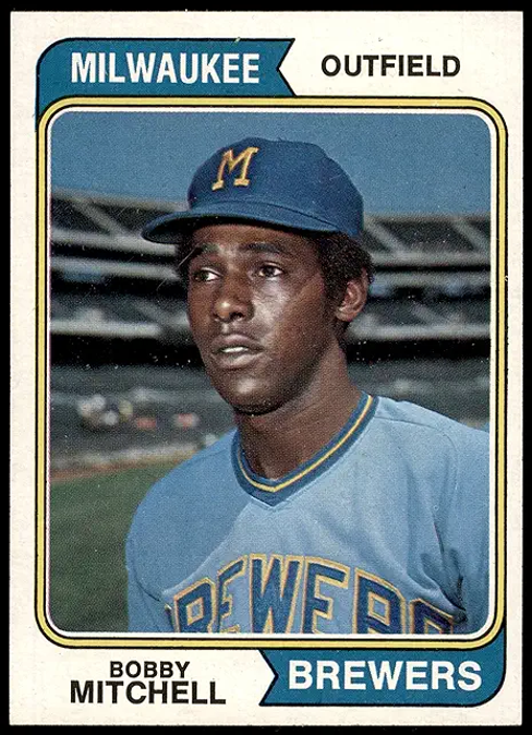
• 1974 Topps: See 1961 entry.
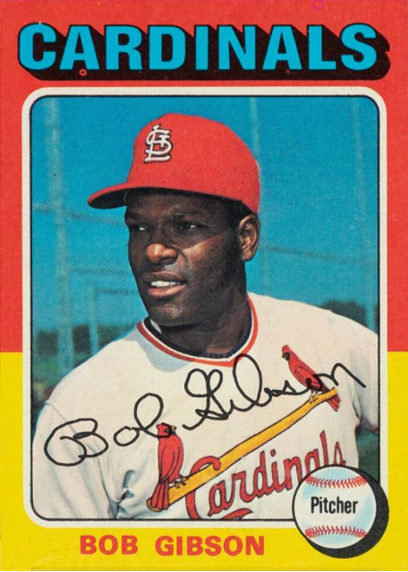
• 1975 Topps: Best use of front color.
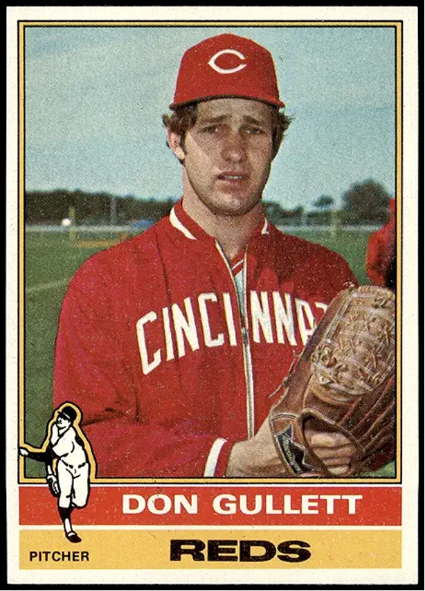
• 1976 Topps: Nothing special here.
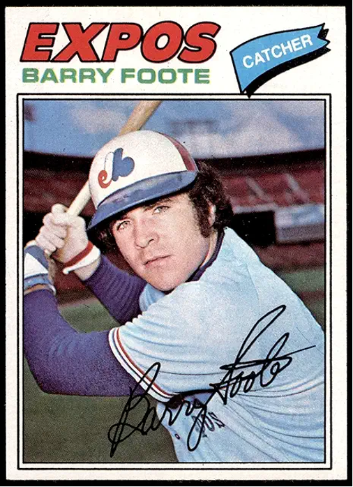
• 1977 Topps: Ditto.
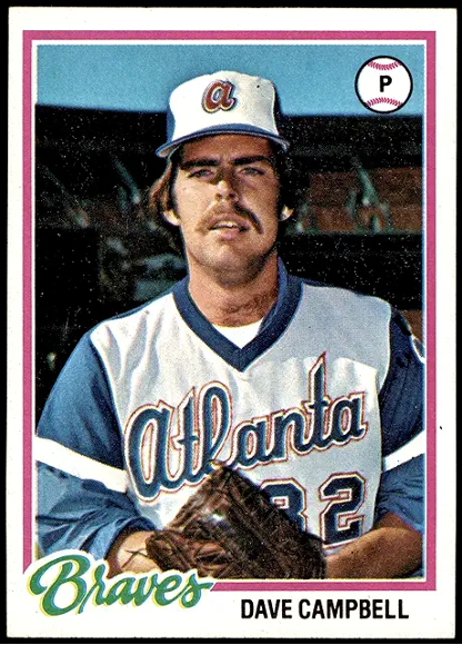
• 1978 Topps: Much better than 1976-77.
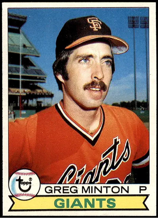
• 1979 Topps: Zzzzz … another green back.
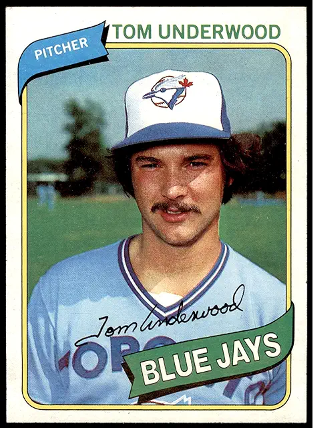
• 1980 Topps: 1974 Xeroxed.
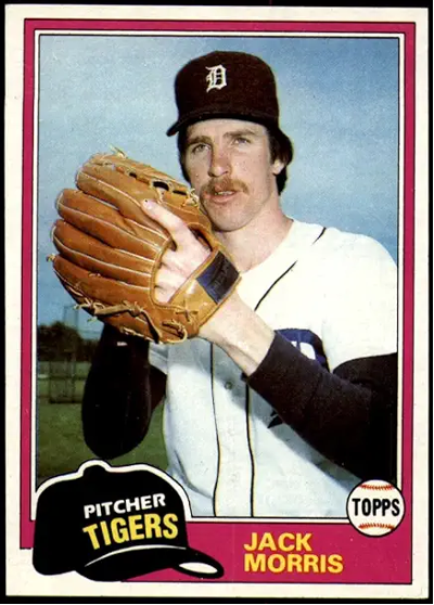
• 1981 Topps: Competition brings some improvement.
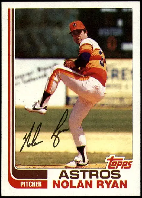
• 1982 Topps: Hockey anyone? Worst set ever.
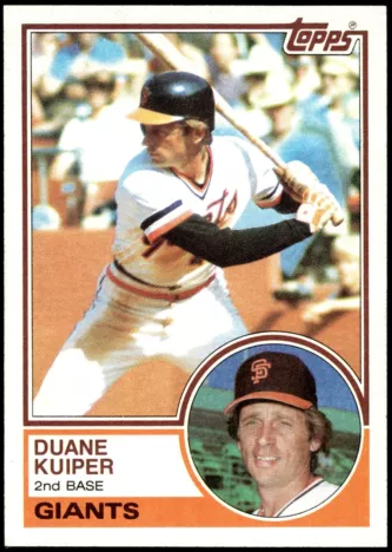
• 1983 Topps: Déjà vu 1963. Excellent.
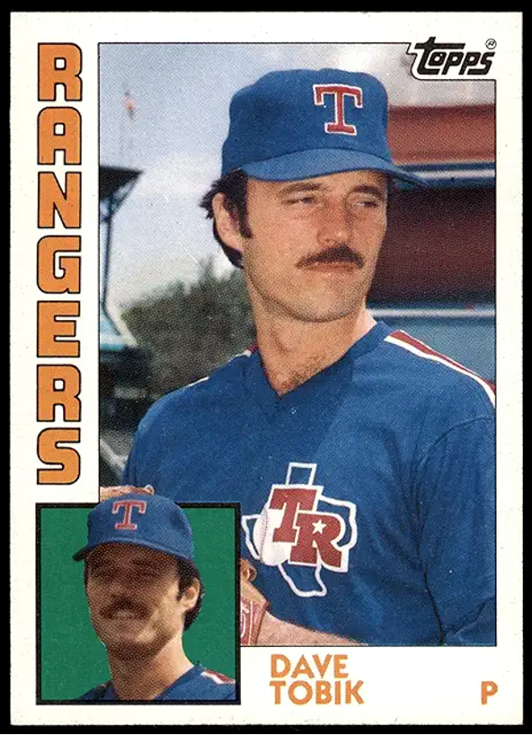
• 1984 Topps: Looks like a football set.
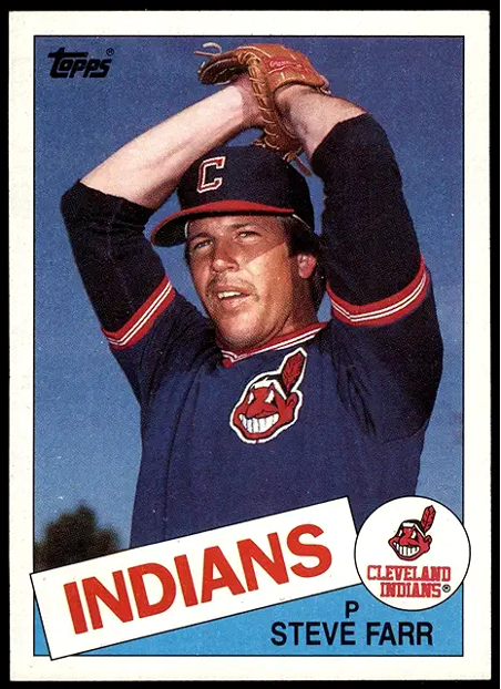
• 1985 Topps: Grainy, blotchy photos abound.
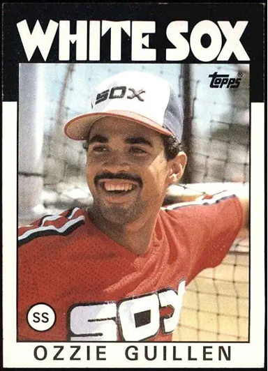
• 1986 Topps: Black is not always beautiful.
FLEER
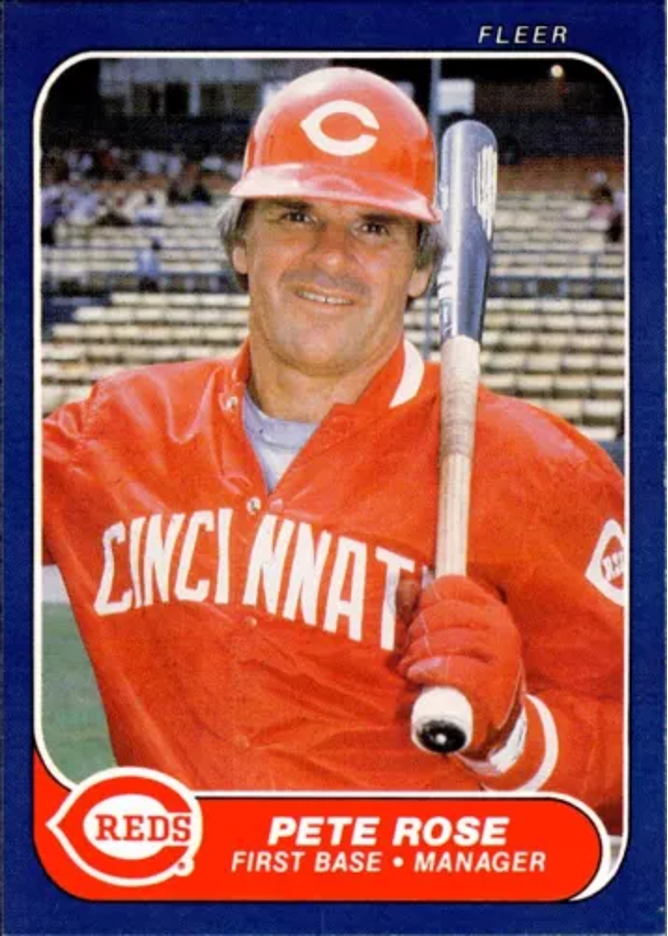
• 1981 Fleer: To err is human.
• 1982 Fleer: More errors, blurred photos, ugly.
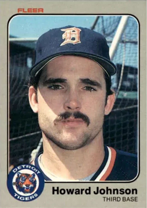
• 1983 Fleer: Third-year Fleer is clear.
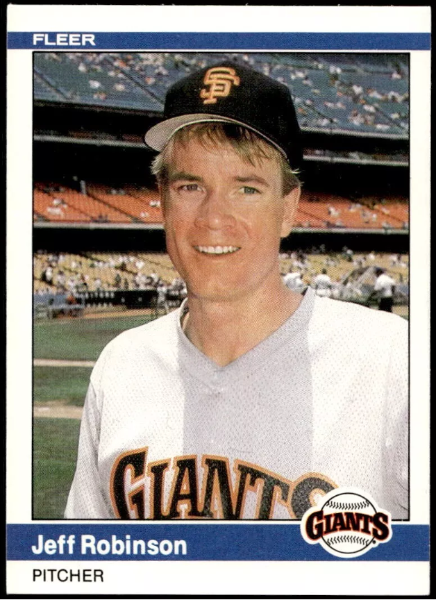
• 1984 Fleer: Clean, crisp, consistent design.
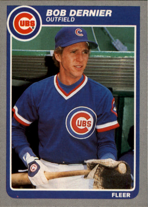
• 1985 Fleer: Another gloomy gray front.
• 1986 Fleer: Spell it B-O-R-I-N-G.
DONRUSS
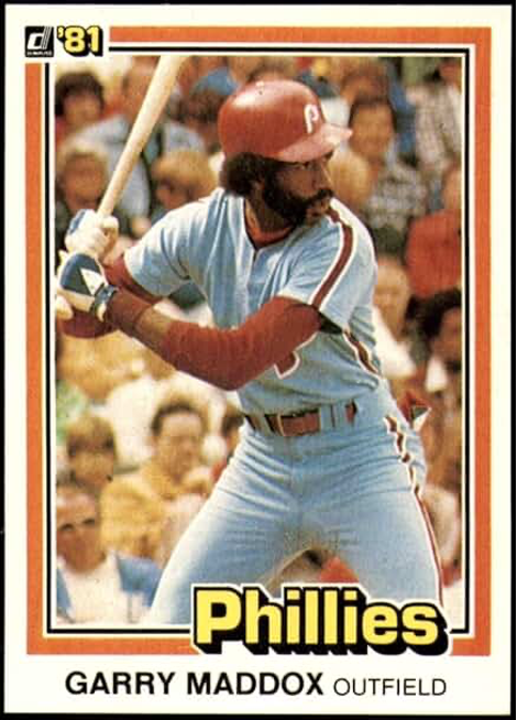
• 1981 Donruss: Thin is in.
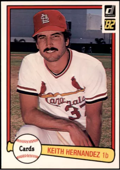
• 1982 Donruss: Thicker than water (and 1981s).
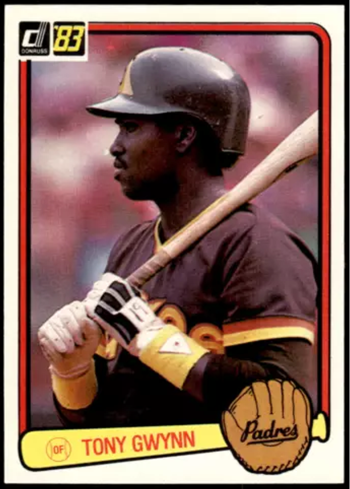
• 1983 Donruss: Hahahahaha.
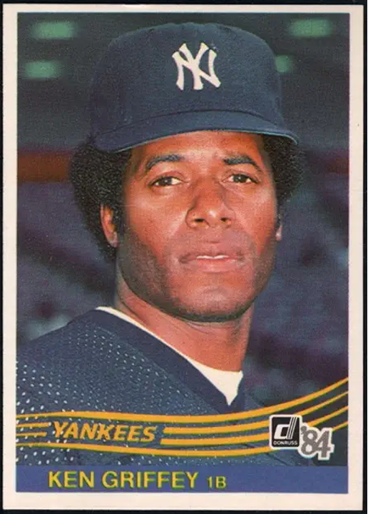
• 1984 Donruss: Reminiscent of the 1957 Topps.
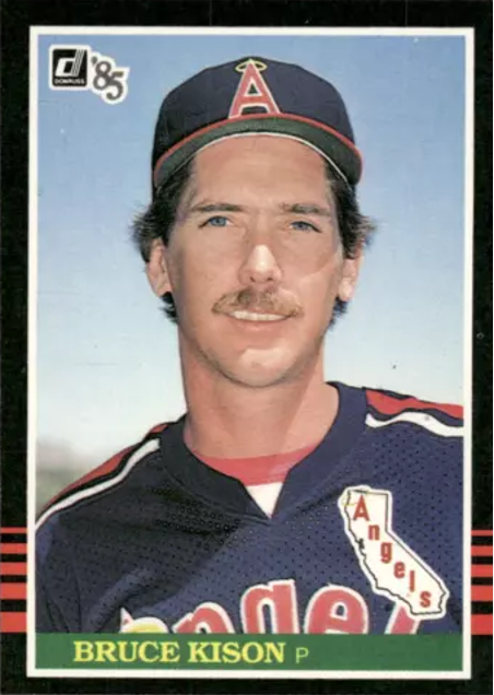
• 1985 Donruss: A black beauty.
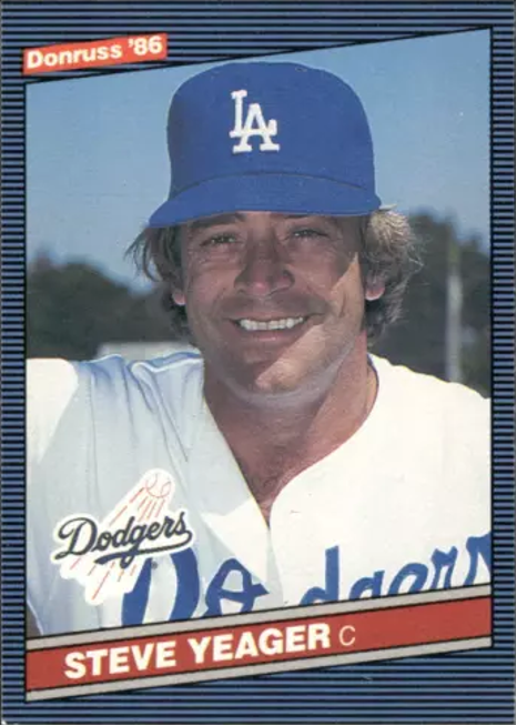
• 1986 Donruss: Memphis gang does it again!
• • • • • •
• Originally Published in Oct. 1986 “Baseball Hobby News” •
THIS ARTICLE FROM “BASEBALL HOBBY NEWS” MAGAZINE IS REPRINTED WITH THE PERMISSION OF BOTH THE EDITOR/PUBLISHER AND THE AUTHOR. IT HAS BEEN RETYPED, BUT NO CONTENT HAS BEEN CHANGED (EXCEPT FOR VERY MINOR ADJUSTMENTS, CORRECTIONS TO TYPOGRAPHICAL ERRORS AND CHANGES TO GRAPHICS). COMMENTS OR INFORMATION IN THE ARTICLE MAY BE OUT-OF-DATE.
To keep up-to-date on additions to this
website, subscribe at bottom of this page*
* Your email address will never be shared and is only used to announce new articles
