
BY MARK A. LARSON
By and large, the 1985 baseball cards produced by Topps, Fleer and Donruss aren’t too bad. But as in years past, there are some things that stand out, and a few things that could be improved. Looking at the design of each set separately, let’s see how they stack up …
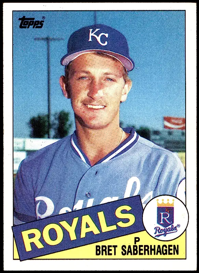
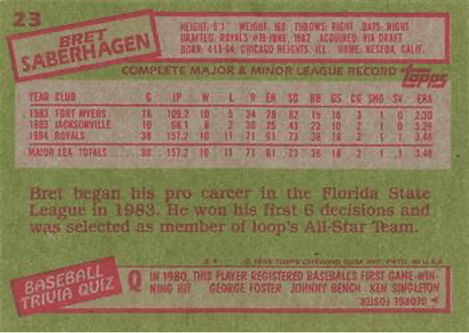
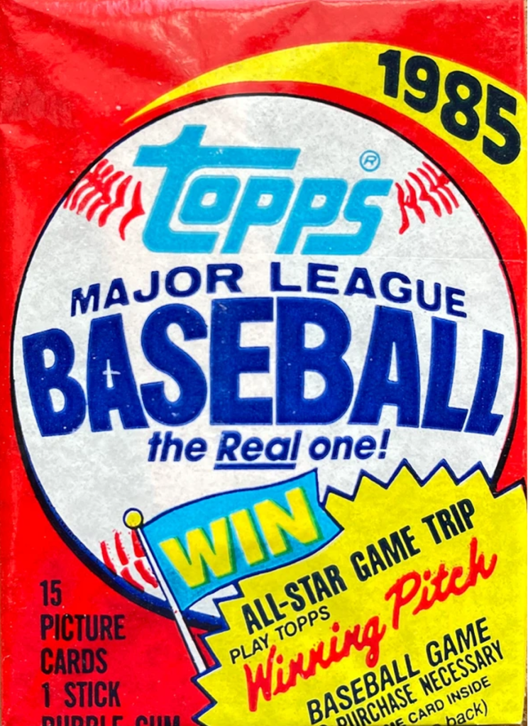
1985 TOPPS: Complaining about Topps issues seems to be a hobby within our hobby. Too many sets, ugly cards, high prices, etc., etc., etc. Well, like the old saying goes, there’s some good news and some bad news about Topps’ 1985 set. First the good news. The front design of their cards is much improved over last year. For the first time in 20 years, “The Real One” has used team logos on the card fronts. (I hope collectors like team logos because all three companies use them this year.) And the fronts aren’t as cluttered as last year. Yet they’re not as good as 1983. As for the back design … here’s where I really get to let loose at Topps. As usual, Topps uses gray cardboard – which makes the reverse of the cards darn near impossible to read. However, Topps has done one better this year. They’ve used a putrid lime-green color to go along with the gray. If this isn’t nauseating, I don’t know what is. I absolutely detest the color green on gray cardboard. (The 1982 Topps cards were even worse than this year.) In addition, Topps is number one in poor use of ink. The photos and colors are grainy and if you compare the team colors from player-to-player you’ll notice some are less brilliant than others. Topps, you blew it again. So what else is new?
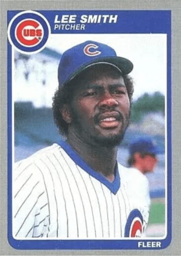
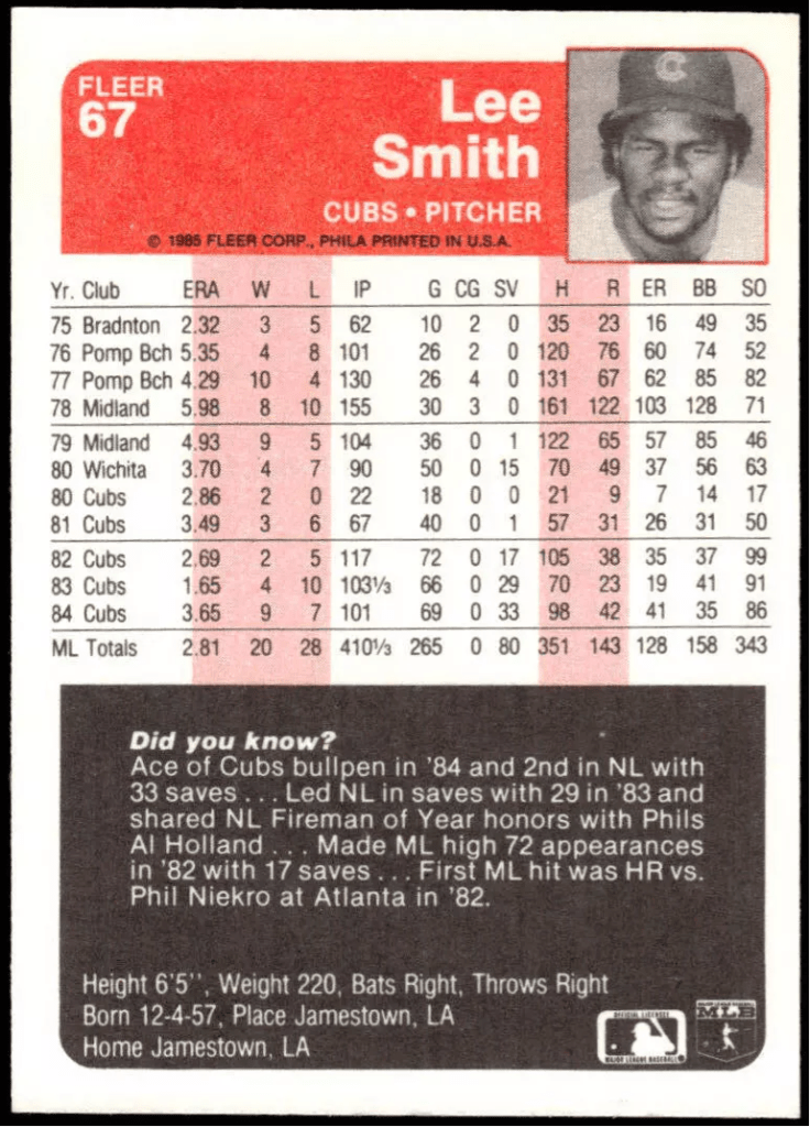
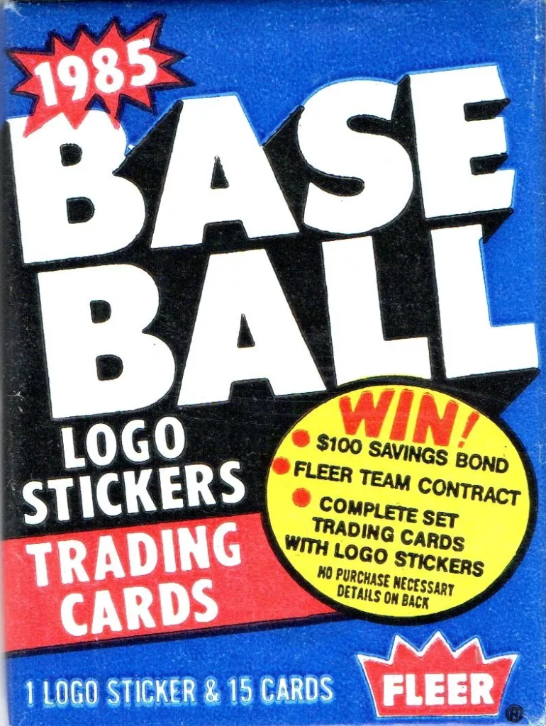
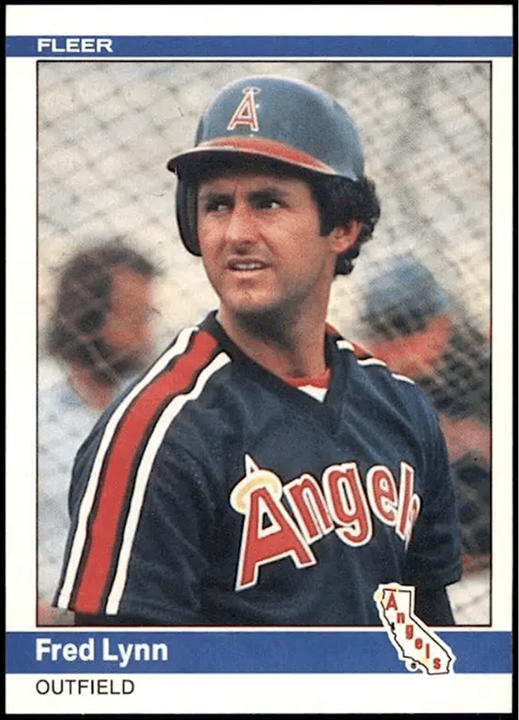
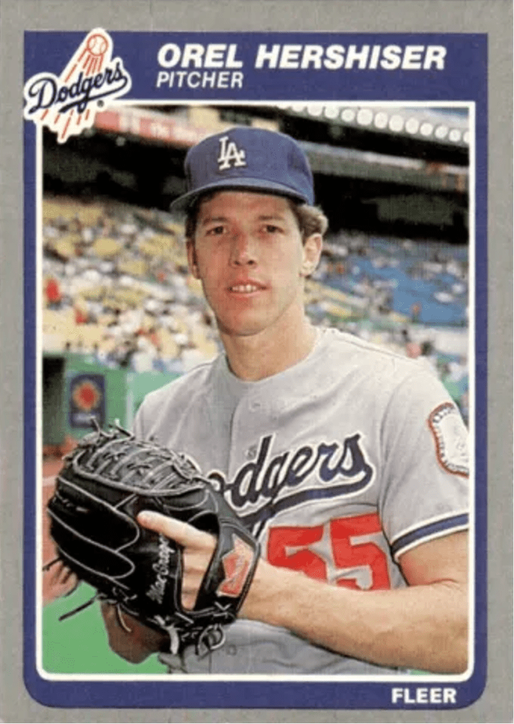
1985 FLEER: For the third straight year Fleer uses team logos on the front of their cards. The frontal design is pretty basic, and as in 1983 they’ve used a gray border. Despite the vibrant colors as an outline around the photos, I’m not too crazy about gray borders. However, Fleer’s photography could be the best ever to grace a national baseball card set – it’s nothing short of stunning this year. Fleer uses the same reverse design its 1983 and 1984 cards had, except red and black are used on white cardboard. Once again, a mostly useless second photo appears on the upper right-hand corners of the backs. Fleer could use a little more imagination on the reverse side of their cards. One comment about the set in general, I have never liked the use of “double cards” to form one larger picture. But Fleer does it again in ’85. All in all, not a bad effort, yet nothing fantastic distinguishes this year’s Fleer set from its two immediate predecessors in 1983-84. However, they were very good too.
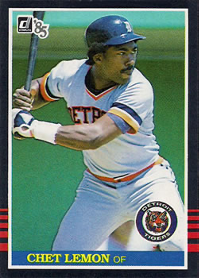
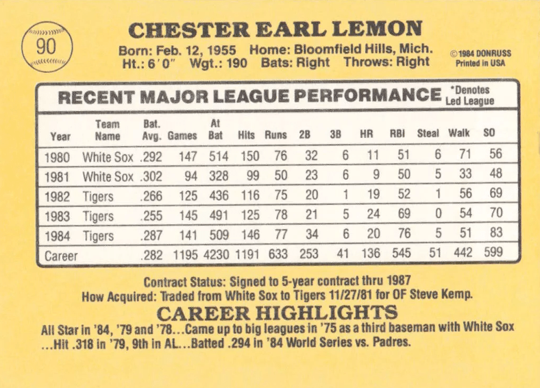
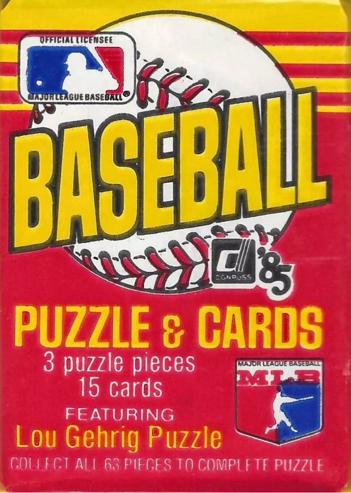
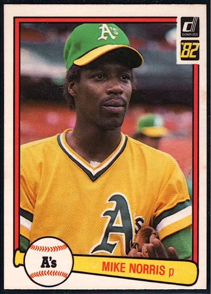
1985 DONRUSS: Donruss also suffers from a case of the “let’s keep the same back design” syndrome. Donruss backs are adequate, but I still don’t like the idea of using incomplete career records. The fronts of the 1985 Donruss cards are pretty nice. Like Topps in 1971, Donruss uses a black border. Only this time they’ve added five red stripes near the bottom of the card. This, coupled with the team logos on the front, make for a fairly impressive-looking design. Donruss’ photography seems to be better than last year when half the white players in the set looked sunburned. But card-for-card it still doesn’t stand up to the excellent Fleer photography. The “Diamond Kings” subset is used again – and this idea is worn out. C’mon Donruss, try something new. (At least there’s no chicken in the set this year.) A very good set – about on par with last year’s.
HOW THEY RANK: On the basis of Fleer having the best reverse design, the best photography and a pretty good-looking front design, I’m going with them as the best-looking set this year. Not too far back would be Donruss with an above-average set. And pulling up the rear … Topps. A good, but far from great front design, along with a back design that’s enough to lose your lunch on, put “The Real Bland One” at the back of the pack. (And do we really need a 792-card set?)
Here’s how I rank the three companies during each of the five years they’ve been battling each other for the baseball card dollar:
• 1981: Topps – Donruss – Fleer
• 1982: Donruss – Fleer – Topps
• 1983: Topps – Fleer – Donruss
• 1984: Fleer – Donruss – Topps
• 1985: Fleer – Donruss – Topps
• • • • • •
• Originally Published in Feb. 1985 “Twin Times” •
THIS ARTICLE FROM THE “TWIN TIMES” NEWSLETTER – OFFICIAL PUBLICATION OF THE TWIN CITIES SPORTS COLLECTORS CLUB – IS REPRINTED WITH THE PERMISSION OF THE AUTHOR. IT HAS BEEN RETYPED, BUT NO CONTENT HAS BEEN CHANGED (EXCEPT FOR VERY MINOR ADJUSTMENTS, CORRECTIONS TO ANY TYPOGRAPHICAL ERRORS AND THE ADDITION OF GRAPHICS). COMMENTS OR INFORMATION IN THE ARTICLE MAY BE OUT-OF-DATE.
To keep up-to-date on additions to BaseballCardFun.com, subscribe below*
* Your email address will never be shared and is only used to announce new articles
