
BY MARK A. LARSON
The year was 1981. The baseball card collecting world was ripe with anticipation, for this would be much more than an ordinary year for the hobby. Indeed, for the first time since 1955, Topps – a name synonymous with baseball cards – would have real competition. After a long court battle, Topps was to lose its exclusive grip on baseball bubble gum cards.



Two new competitors were going to try to give Topps a run for baseball card collectors’ money. The most well-known of the upstarts was Fleer. Based in Philadelphia, Fleer battled Topps once before between 1959-63 when they issued limited sets of baseball cards. Most hobbyists figured Fleer would be Topps’ primary threat, even though a third company was also going to give the national baseball card market a try. This third competitor, Donruss, headquartered in Memphis, had never been in the baseball card business before. But Donruss was not entirely new to the bubble gum card world. Like Topps and Fleer, Donruss had produced many non-sport card sets, including some based on TV shows such as “The Flying Nun” and “The Monkees.”
Most sports hobbyists welcomed Topps’ new rivals since many felt its card sets lacked imagination. And what could be a better remedy than a little good ol’ free market competition to spur the creative juices? For four seasons now the hobby has had three national sets to choose from. But has the competitive spirit bred the desired results of quality and creativity at a moderate price? Each hobbyist must judge for themselves, but as part of the thought process here are my own thoughts on each of the major sets issued since the baseball card wars began in early 1981 …

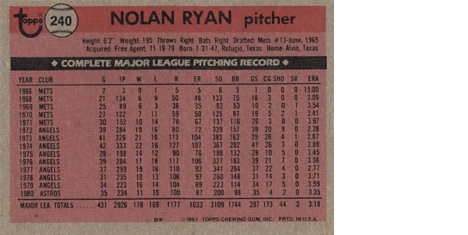
1981 TOPPS —
The 1981 Topps set is usually underrated because it was the year Fleer and Donruss entered the picture – errors and all. The design on the ’81 Topps is simple. The cap on the front, although unpopular with some collectors, is unique. It was never used before on a major card set. Photography in the set is usually quite good. The backs are on gray cardboard with red and black ink. This makes for fairly easy-to-read backs, but like others, I have never been a fan of gray cardboard. If there is one negative factor with this set, it is that it’s neither very exciting, nor particularly lousy. The emergence of Fleer and Donruss obviously didn’t frighten Topps very much.
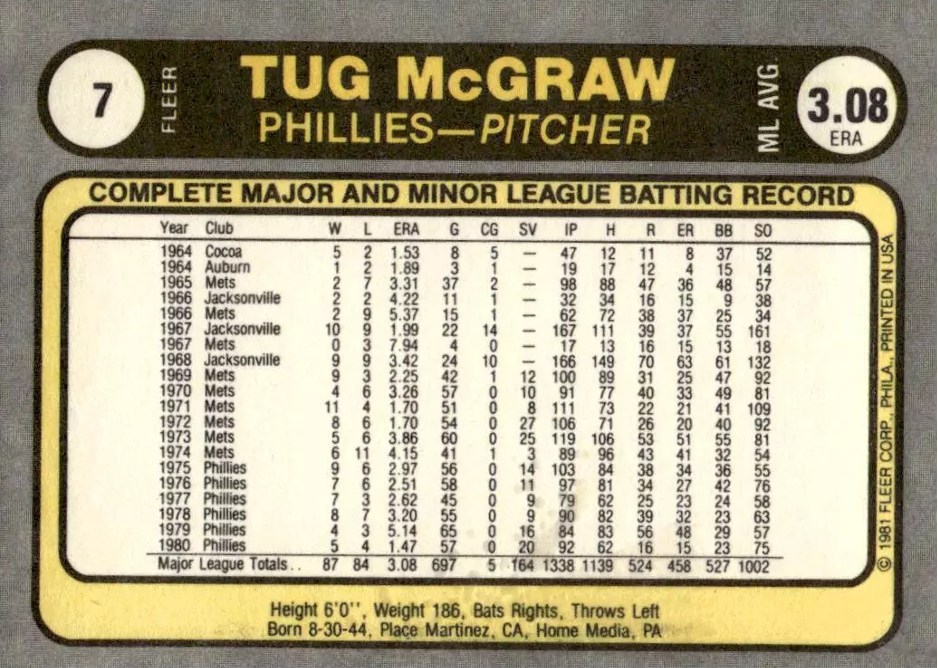

1981 FLEER —
This has got to be the most overrated set of all-time. It was Fleer’s first major card set and everyone wanted to applaud them because – if for no other reason – they weren’t Topps. But just because they weren’t Topps didn’t make it a great card set. Besides a zillion errors and variations, the backs of Fleer’s cards were on white cardboard (a big plus) yet what color ink did they use? Gray! In Fleer’s haste to put out a card set, the backs contained statistics only. And if the player had only a year or two of stats, the rest was left blank. That’s innovative? At least Fleer did make some sense out of how their cards were arranged in the set itself – by team, in alphabetical order. Baseball Hobby News rated the 1981 Fleer set as #1. Yet logic would seem to dictate that a company shouldn’t be praised, but criticized for a set filled with what hindsight indicates were probably deliberate – and thus fraudulent – errors. This set is kind of like all those “The Next Harmon Killebrew” players of years past. A lot of hype, but not much substance.
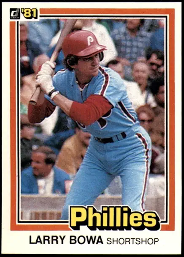
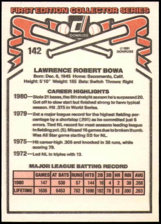
1981 DONRUSS —
Three words are often used to describe the 1981 Donruss set: Thin card stock. The cards were so thin you could fit 600 Donruss cards into a 500-count Topps box. Design-wise, the fronts of the cards were very good. The backs, however, were adequate, but provide very little statistical information. Following Fleer’s lead, the ’81 Donruss set is chock full of errors and variations. Many foresaw a quick demise for Donruss in the baseball card wars. But after a rocky start in 1981, better times were ahead.
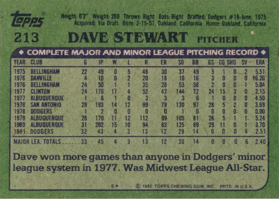
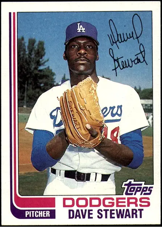
1982 TOPPS —
There is nothing nice that can be said about this set. It is quite simply atrocious. The fronts contain the very unimaginative “hockey stick” design, while the backs have to be the hardest-to-read in the history of the hobby – blue ink on dark green on gray cardboard. This was also the first year Topps produced a 792-card set. Needless to say, that’s about 100 cards too many. Apparently, Fleer and Donruss realize this and have not gone beyond 660 cards per set. If competition was supposed to force a better product, Topps didn’t get the message in 1982. Boo, hisss.
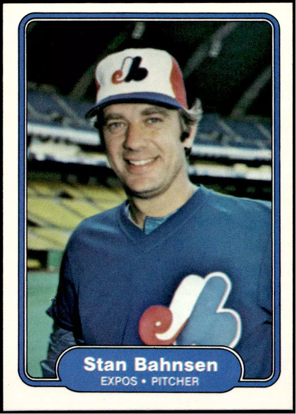
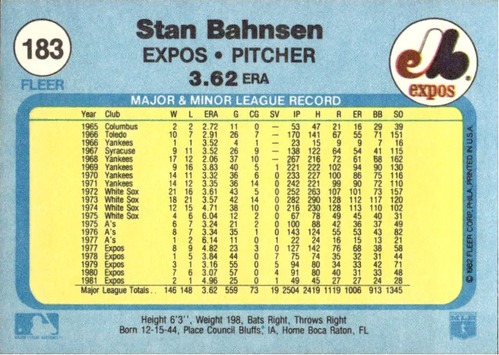
• 1982 FLEER —
Design-wise the 1982 Fleer set was better than 1981, but fuzzy photos abound and really ruin the set. Also, for the second year in a row, many errors and variations appeared. This led most collectors to the conclusion that Fleer was using the mistakes as a come-on to entice them to buy more cards. (It worked in 1981, why not again in 1982?) The front design was simple, perhaps too simple. The backs, however, were a vast improvement over the previous year. They featured blue and yellow colors on white cardboard, plus multi-colored team logos. It’s too bad the set was filled with poor pictures and needless variations. But like good wine, Fleer would improve with age.
1982 DONRUSS —
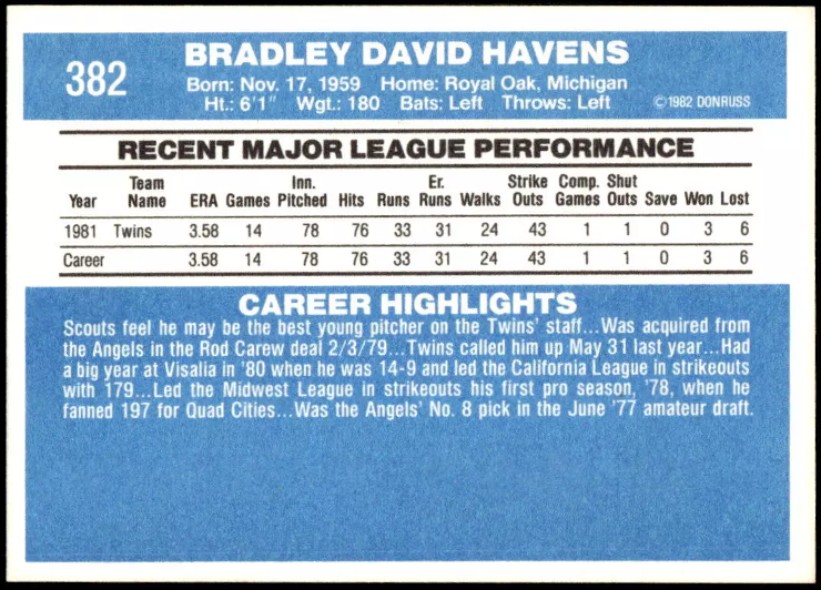
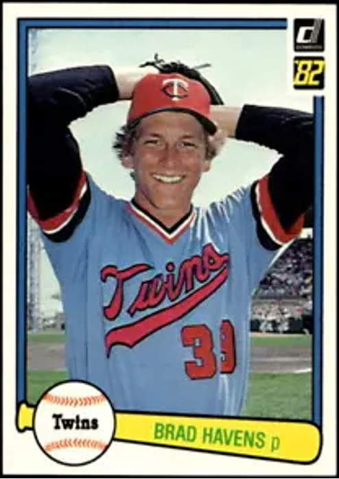
Donruss receives the “Comeback Card Set of the Year” award for 1982. Its front ball-and-bat design combined with the blue and white backs make the set very attractive. The biggest improvement, though, was the use of thicker card stock. There was only one drawback to the cards, that being the inclusion of statistics for only the last five years of a player’s career. This was also the first year for the “Diamond Kings” subset, which while innovative at the time, it has lost its luster by being repeated in 1983 and 1984. All in all, the 1982 Donruss set is very good.
1983 TOPPS —
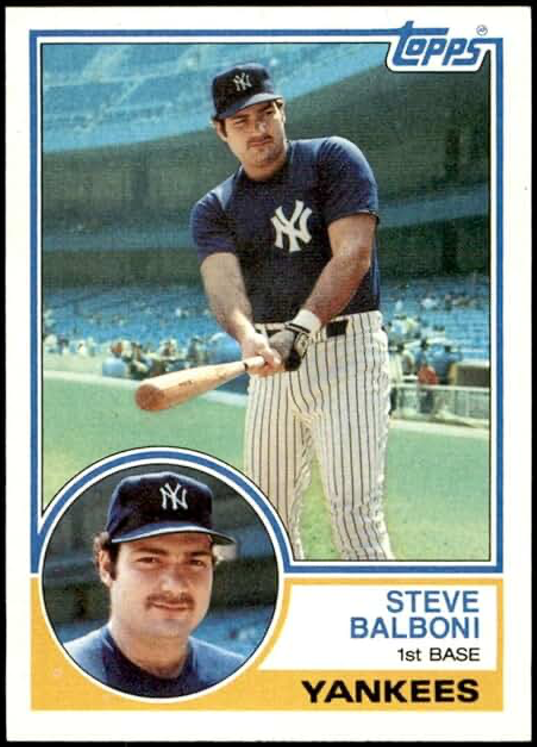
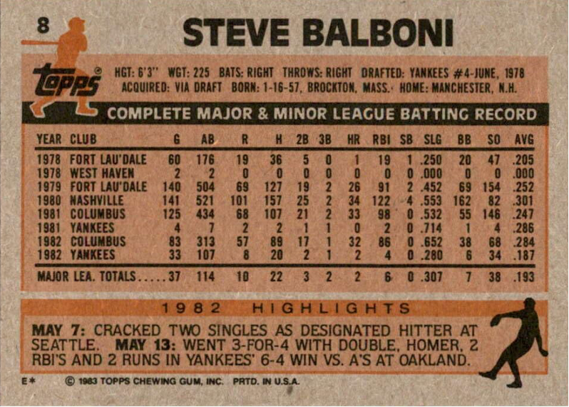
After a dismal 1982 set, Topps bounced back with its best set since 1975. Reminiscent of the 1963 Topps, the front design features two photos – the smaller one, a close-up enclosed in a circle. The backs were easier to read too, even though gray cardboard was still used. Again, the set contained too many cards at 792, but that fact can be overlooked. A subset of “Superveterans” is interesting, although stretched a bit when the likes of Gene Garber and Dave LaRoche are included.
1983 FLEER —
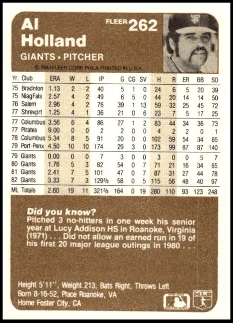
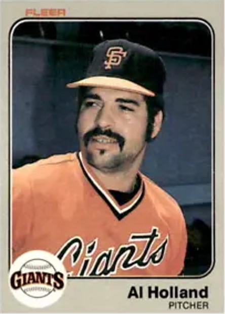
Like Topps, Fleer also made a great comeback with their 1983 set. An excellent front design, including the colorful team logos, plus a revised brown and white reverse make this an extremely good-looking set. The gray fronts really remind one of the 1970 Topps set. But other things also stand out. First, there were no idiotic errors. And secondly, Fleer photographers figured out how to focus their cameras. Gone are the eye-wrenching blurred photos. The 1983 Fleer set also features two photos – the second one is on the back. This is an excellent set, however, do we really need that 5/8ths by 5/8ths-inch photo on the reverse?
1983 DONRUSS —
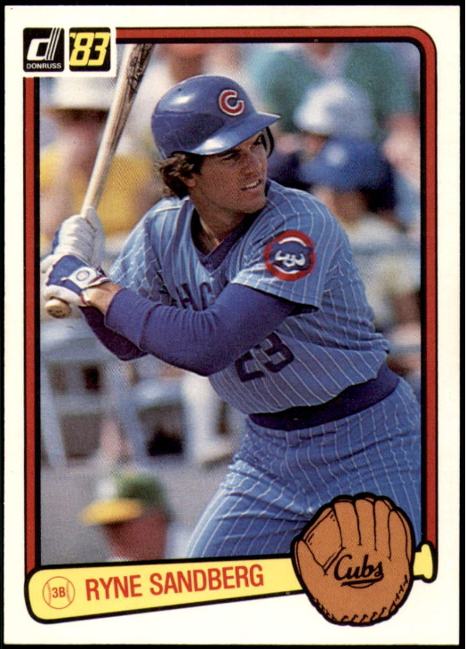
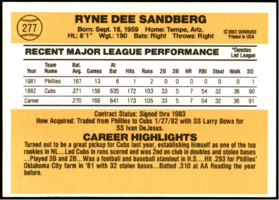
If you liked the ’82 Donruss set, you’ll love the ’83s. The card design is almost identical. Diamond Kings appear again. The only major addition to the set (if you can call it a major addition) is the San Diego Chicken. The Chicken belongs in a baseball card set about as much as Richard Nixon does. This set proves Donruss was just plain lazy. I’m surprised they didn’t use the same photographs as 1982 too.
• • • • •
THE 1984 SETS —
In an earlier issue of Twin Times, I expressed my opinions on the three ’84 sets. But briefly … Topps’ front design does not thrill me. Last year’s second photo was better. However, the backs are much improved. I really like the 1984 Fleer set, although the back design is too similar to 1983. The blue and white front and back color theme is very good. Donruss’ front design is nice, the backs are the same old thing, and of course we’ve got the overrated Diamond Kings. (And the Chicken, too, is back.) I’m not as enthusiastic about the 1984 sets as I was about the ’83s. But overall they’re not too bad
• • • • •
The big question is, has the three-way battle improved card sets and been beneficial to the average collector?
Any time there is increased competition, in the long run, it is beneficial. Who can say what Topps might have put out had it not been for Fleer and Donruss breathing down their neck? At least we now have a wider variety of current card sets and that’s got to be good. But will Fleer and Donruss survive to continue challenging “The Real One?” I don’t know either company’s financial situation, but if they put out imaginative products they may thrive. If they don’t produce top quality products they will deserve to fold. That will be their loss, not ours. For if we continue to just get puzzle pieces, Diamond Kings, Chickens, logo stickers, update sets and the like, Fleer and Donruss will have missed a golden opportunity to de-throne the moldy minds at Topps. After all, a dozen variations of their 1984 set (giants, bronzed, glossies, etc.) proves that Topps can get into a rut and become overly complacent. May the best company (or companies) win. When that happens, we all come out ahead.
See related article on BaseballCardFun.com entitled:
“TWIN TIMES — Topps, Fleer and Donruss: Rating the 1984 Cards”
Click Link Here
• • • • • •
• Originally Published in Sep. 1984 “Twin Times” •
THIS ARTICLE FROM THE “TWIN TIMES” NEWSLETTER – OFFICIAL PUBLICATION OF THE TWIN CITIES SPORTS COLLECTORS CLUB – IS REPRINTED WITH THE PERMISSION OF THE AUTHOR. IT HAS BEEN RETYPED, BUT NO CONTENT HAS BEEN CHANGED (EXCEPT FOR VERY MINOR ADJUSTMENTS, CORRECTIONS TO ANY TYPOGRAPHICAL ERRORS AND THE ADDITION OF GRAPHICS). COMMENTS OR INFORMATION IN THE ARTICLE MAY BE OUT-OF-DATE.
To keep up-to-date on additions to BaseballCardFun.com, subscribe below*
* Your email address will never be shared and is only used to announce new articles

