BY MARK A. LARSON
This is the fourth year baseball card collectors have had three national sets to choose from and compare. Overall, 1984 has provided the collector with one of the best selections of sets since the addition of Fleer and Donruss to the scene. Primarily, I’m most concerned with the actual design – front and back – of the cards, but other factors may be taken into account when rating the sets.
1984 TOPPS: In its frontal design, Topps has once again shown a disturbing lack of imagination. The second, smaller photo is a repeat of last year and is totally unnecessary. The rest of the front seems borrowed from other Topps sports sets of the 1970s. However, the backs of the 1984 cards rank near the top, especially compared to some recent Topps issues. The red and blue design is a vast improvement over the hideous green ink that Topps seems to have in abundance. And in a direct assault on Fleer, Topps has copied the team logo idea and added it to the back of the 1984 cards. But generally, front and back, Topps has proven once again that creativity is a dirty word for them.
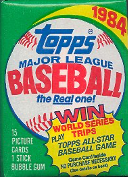
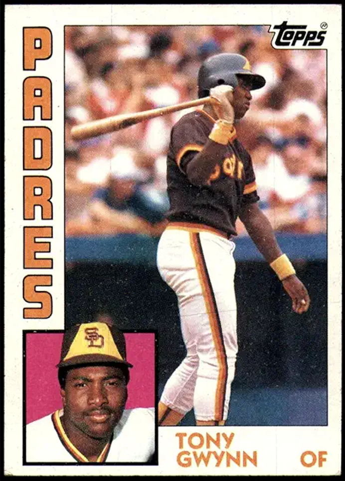

One thing I wish Topps would do is cut down the number of cards in the set – 792 in way beyond what is necessary. (That’s 30 cards per team.) Topps also has a way of packaging their wax packs so one card is always left with a giant glue stain on it. This, in reality, means there are only 14 cards in a pack because the 15th card is virtually worthless. Topps has always made it difficult to obtain a complete set through buying wax and rak-paks, and 1984 is no different. I bought over 2,500 cards in both wax and rak-paks and still needed 29 to complete the set. Some things never change …
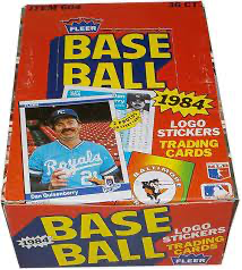
1984 FLEER: This year marks Fleer’s best effort since returning to the baseball field in 1981. The fronts are basic, but tasteful. The backs are pretty much a repeat of last year, but the white and blue colors are attractive. In fact, the overall white and blue theme on both front and back makes the 1984 Fleers one of the best looking cards in many years. The team logos on the front have always been a favorite of mine. Yet the additional photo on the back is ridiculous. It’s too small to be meaningful and just takes up space. If Fleer has one weakness, it’s that besides statistics there is never very much useful information given on the back of the card. Usually just a one-liner.
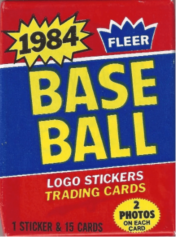

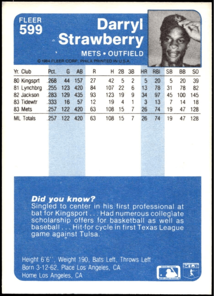
One nice thing about Fleer, it is relatively easy to complete a set from wax packs – especially when compared to Topps, or even worse, Donruss. This year’s Fleer’s photos are sharp. However, Fleer has an annoying tendency to include some very dumb photos. Glenn Hubbard of the Braves is shown with a snake around his neck and Jay Johnstone of the Cubs is shown wearing a Budweiser umbrella-like sun visor on his head. Neither photo belongs in a baseball card set. I don’t find them cute and they detract from an otherwise excellent set.
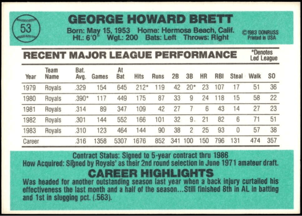
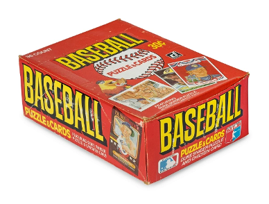
1984 DONRUSS: At least this year Donruss made an attempt to change the front of their cards. I like the 1984 design. Plus, Donruss must own the best camera equipment of the three companies because their photos are sharp and the color is excellent. When looking through the 1984 Donruss cards, I had the eerie feeling I was seeing the 1957 Topps set 27 years later. The photos, although much brighter, just seem to have the ’57 Topps look and feel about them. I have never particularly cared for Donruss backs. I like statistics from the player’s complete career, not just the past five years. This year’s blue-green color is OK, but 1982’s blue and 1983’s yellow were much brighter – and better.
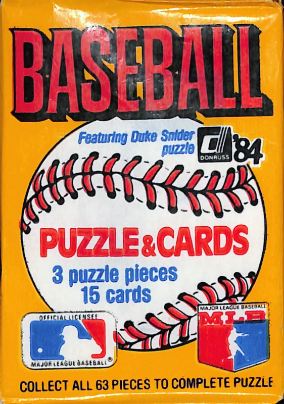
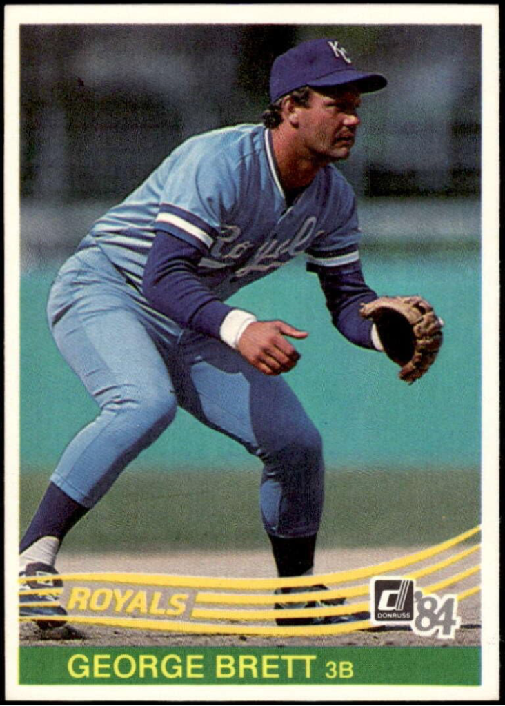
Donruss’ Diamond Kings sub-set has always been overrated in my book. And after three years now, I’m tired of it. The Donruss creativity department must be trying to outdo Topps for lack of inventiveness. Ditto on the Chicken card. Once was neat, twice was tolerable. But three times is boring. Donruss has always had a distribution problem within its wax packs and boxes. Although I’ve only bought one box so far this year, others have commented that Donruss still has more than its share of problems in this area.
FINAL THOUGHTS: My ratings for the 1984 baseball card sets.
• #1 FLEER (Nice blue and white design, with generally very good photos.)
• #2 DONRUSS (Good frontal design, great photos, but backs never change.)
• #3 TOPPS (An improved back design can’t compensate for a lousy front).

• • • • • •
• Originally Published in Mar. 1984 “Twin Times” •
THIS ARTICLE FROM THE “TWIN TIMES” NEWSLETTER – OFFICIAL PUBLICATION OF THE TWIN CITIES SPORTS COLLECTORS CLUB – IS REPRINTED WITH THE PERMISSION OF THE AUTHOR. IT HAS BEEN RETYPED, BUT NO CONTENT HAS BEEN CHANGED (EXCEPT FOR VERY MINOR ADJUSTMENTS, CORRECTIONS TO ANY TYPOGRAPHICAL ERRORS AND THE ADDITION OF GRAPHICS). COMMENTS OR INFORMATION IN THE ARTICLE MAY BE OUT-OF-DATE.
To keep up-to-date on additions to BaseballCardFun.com, subscribe below*
* Your email address will never be shared and is only used to announce new articles
